In recent years, millets have made a strong comeback. They used to be considered regular grains, but now people are discovering them as superfoods in modern kitchens. Consumers are increasingly searching for millet products as they gain knowledge on health, sustainability, and clean eating. But in a competitive retail environment, the packaging tells the story, not just the product.
Source: in.pinterest.com
Source: in.pinterest.com
What’s Shaping the Way We See Millets Today?
Design details aside, the term “modern millet consumer” needs to be defined. Buyers today are smarter and better informed than ever. They asked for more than just healthy options – they wanted transparency and sustainability. Millets have a huge fan following, starting from health freaks, fitness enthusiasts to individuals suffering from lifestyle diseases like Diabetes.
.This group wants things to be simple, obvious, and real. Consumers want brands to be honest and not overpromise. Therefore, the packaging should reflect these values and be clean, informative, and visually appealing without overwhelming the consumer.
Source: in.pinterest.com
Source: in.pinterest.com
Source: in.pinterest.com
Source: in.pinterest.com
The Importance of Narrative in Millet Packaging.
Linking Tradition with Contemporary Taste
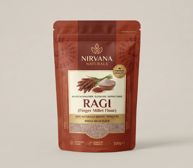
Millets have deep roots in traditional agriculture and regional cuisines. This heritage is a strong advantage when creating packaging. Effective millet packaging design connects tradition with modern lifestyle. It shares a story that resonates emotionally with consumers. Using elements like earthy colors, hand-drawn illustrations, or subtle cultural motifs can create a sense of authenticity. At the same time, modern typography and simple layouts make the product feel relevant to today’s audiences. The combination of old and new is what makes the packaging memorable.
Source: in.pinterest.com
Source: in.pinterest.com
Source: in.pinterest.com
Source: in.pinterest.com
Building a Brand Narrative
Every successful graphic design tells a story. For millets, this story could focus on themes like sustainability, farmer empowerment, organic farming, or healthy living. Rather than just listing features, the packaging should explain why the product is important. A brief, engaging brand story included on the package can foster a stronger connection. When consumers feel an emotional tie to a product, they are more likely to select it over competing options.
Source: in.pinterest.com
Source: in.pinterest.com
Source: in.pinterest.com
Source: in.pinterest.com
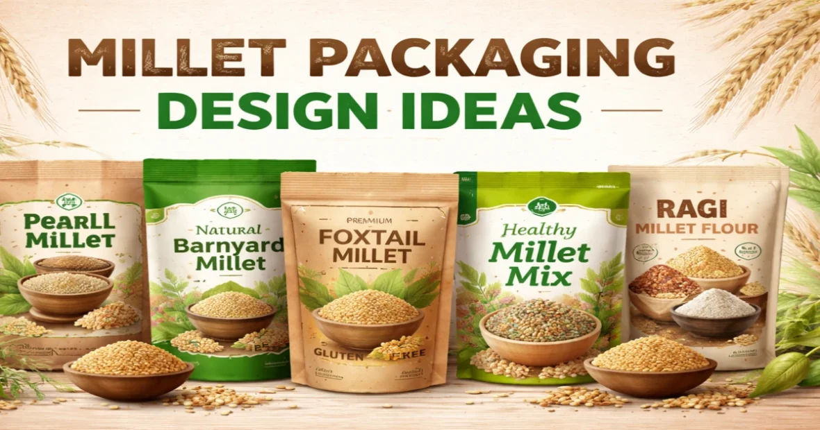
Key Elements of Effective Millet Packaging Design
Hierarchy and Visual Clarity
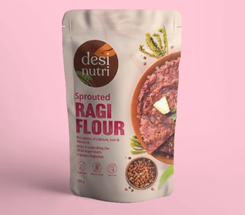
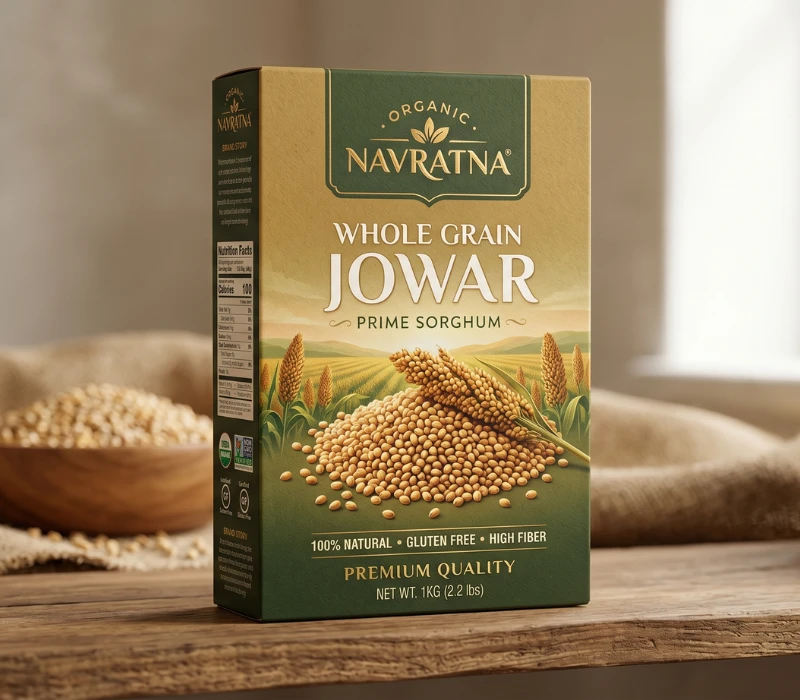
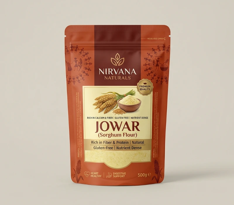
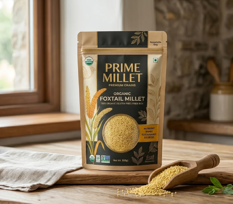
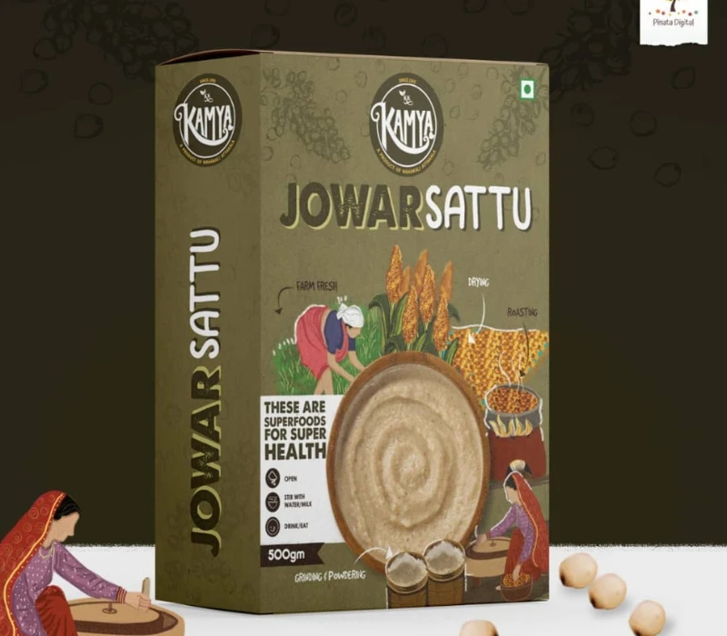
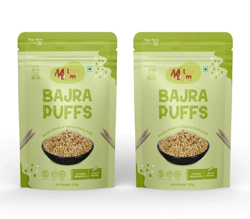
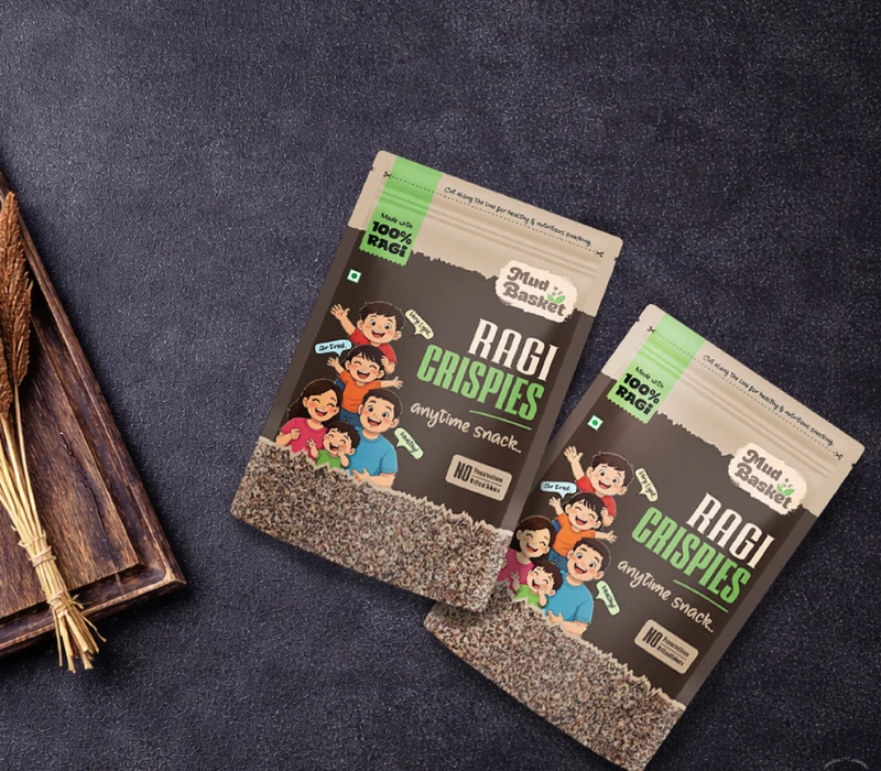
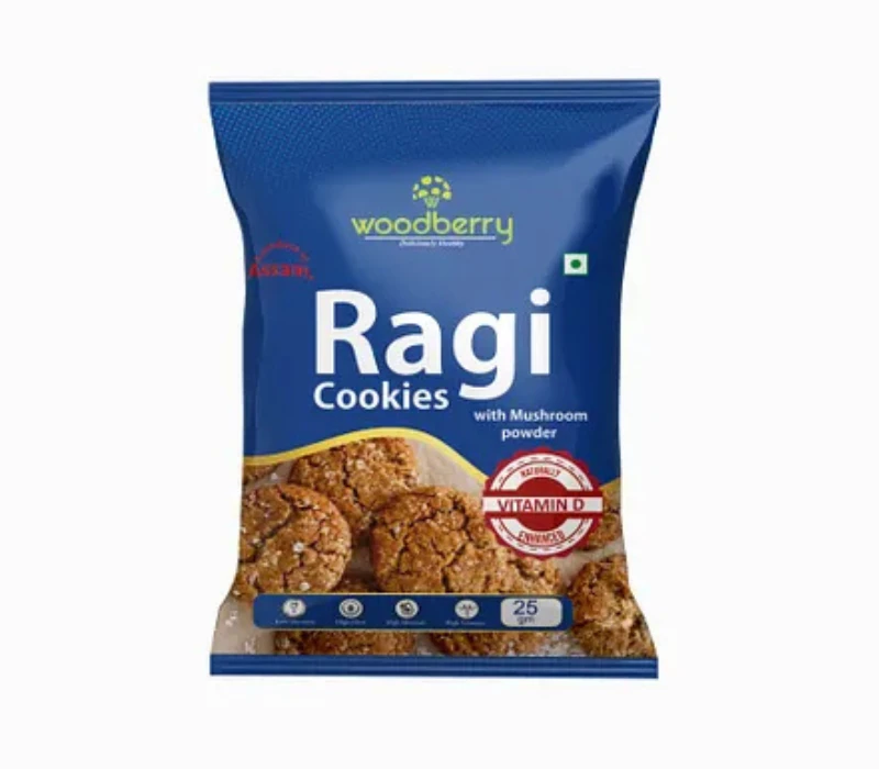
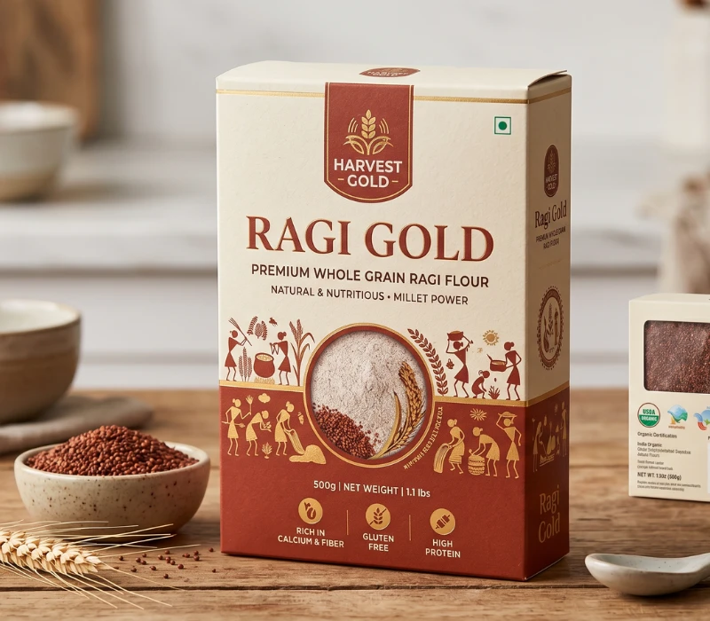
A package design is supposed to make the viewer’s eye travel in a certain manner without effort. The name of the product, type of millets, and key benefits must be visible on the first view. Don’t overfill the design with too much information or too many pictures. Millet packaging has to be clear because there are still many consumers who are not aware of the types of millets. Clearly mentioning if the product is ragi, bajra, or foxtail millet eliminates confusion and helps in making a confident purchase.
Source: in.pinterest.com
Source: in.pinterest.com
The Psychology of Color in Packaging Design
A good package design leads the viewer’s eye easily. The product name, type of millet, and benefits are clearly visible at a glance. Don’t try to pack in too much information or too many images. Millet packaging also needs to be clear, as many consumers are still being introduced to the various millets. Clearly mentioning whether it is ragi, bajra, or foxtail millet helps in easing the confusion and gives the purchaser confidence.
Source: in.pinterest.com
Source: in.pinterest.com
Typography That Shouts Out Loud and Clear
The typography must be easy to read and reflect the personality of the brand. Fonts that are too large can make the packaging look cluttered and make it harder to read. Simple, modern typefaces with a traditional look are usually the best for millet products. The size ratios between the different fonts are equally important. The product name should be the most dominant, followed by other details like nutritional benefits, cooking instructions, and certifications.
Source: in.pinterest.com
Source: in.pinterest.com
Information Architecture to Trust Design
Transparency and Labeling
Today’s buyers demand transparency. Show information on nutrition, sourcing, certifications , and cooking instructions clearly. It should be good adherence to quality, which is easy to locate and easy to read. Don’t bombard the customer with too many technical terms. Just present the data in a way that’s more user-friendly and educates you, instead of confusing you
Source: in.pinterest.com
Source: in.pinterest.com
Highlighting Health Benefits
Millet is a superfood with many benefits, such as being high in fiber, minerals, and antioxidants. The packaging should convey these advantages in a subtle but convincing way. Instead of making over-the-top claims, just be clearly honest. Statements about natural goodness, high nutrition, and overall wholesomeness of the food can have a strong appeal to consumers.
Source: in.pinterest.com
Source: in.pinterest.com
Conclusion: Designing Packaging That Sells and Sustains
Millet packaging design is a perfect cocktail of storytelling, utility, and aesthetics. It is the core of a good business or product manager to know about their product, the people who eat it, and the ongoing trends in the market. Through greater transparency, honesty, and sustainability, packaging can be a tool to help brands turn themselves into long-term partners rather than one-off attention-grabbers.
Great millet packaging design is a brand’s token, and a brand’s token is great luxury packaging design. Jokes aside, packaging is a very significant part of branding, and a well-crafted packaging can help a brand reach the skies.