Coffee packaging design does much more than protect beans or ground coffee. It sets expectations before the first sip is taken. In a category driven by aroma, origin, and emotion, packaging becomes the bridge between the product and the experience a consumer imagines. When someone picks up a coffee pack, they are not just buying a beverage; they are buying a mood, a routine, and often a personal ritual.
From specialty cafés to supermarket shelves, coffee packaging design plays a defining role in how a brand is perceived. The colors, textures, typography, and structure all communicate quality, origin, and personality long before taste confirms it.
Why Coffee Packaging Design Matters in a Competitive Market
Coffee is one of the most competitive FMCG and specialty food categories in the world. Consumers are faced with endless choices, many of which offer similar flavor profiles and price points. In this environment, coffee packaging design becomes the first differentiator.
Well-designed packaging builds immediate trust. It tells the consumer that care has been taken, not only in roasting the beans but also in presenting them. Brands that invest in thoughtful packaging design often enjoy higher shelf visibility, stronger brand recall, and better perceived quality, even before the product is tried.
In both retail and online environments, packaging is often the deciding factor between curiosity and conversion.
The Emotional Role of Coffee Packaging Design
Coffee is deeply emotional. For some, it is a morning necessity. For others, it is a slow, mindful experience. Coffee packaging design must reflect this emotional connection.
Minimalist designs often communicate calm and sophistication, while bold designs suggest energy and creativity. Earthy tones may highlight sustainability and origin, while darker palettes can signal richness and depth. These emotional cues guide the buyer toward the coffee that feels right for them.
When these cues are supported by a strong logo design, the brand becomes recognizable and emotionally familiar over time.
Core Elements of Effective Coffee Packaging Design
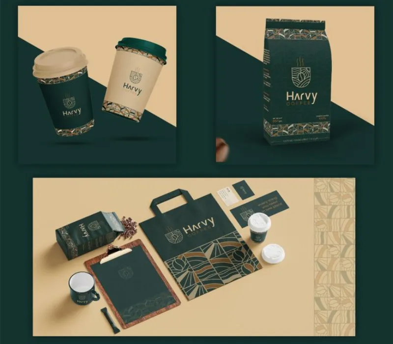
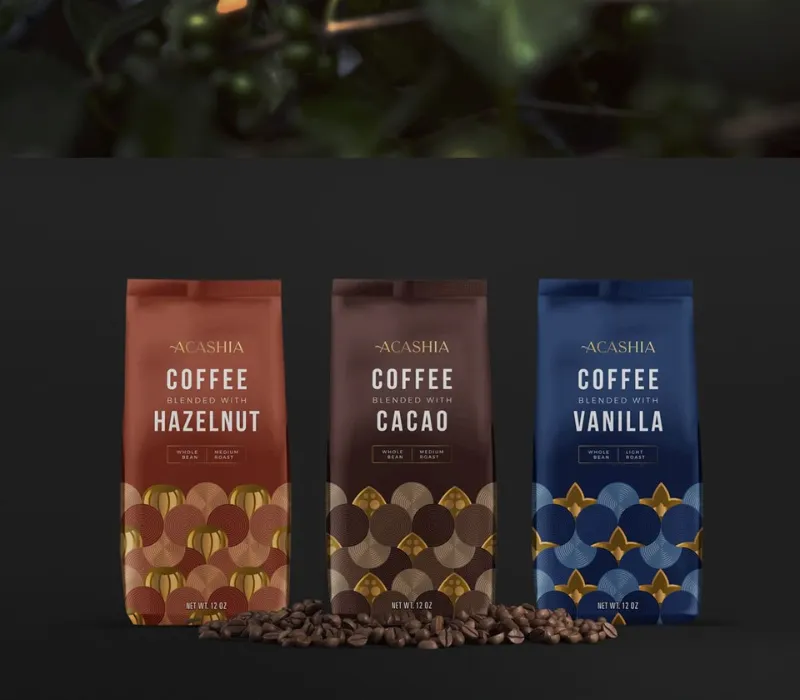
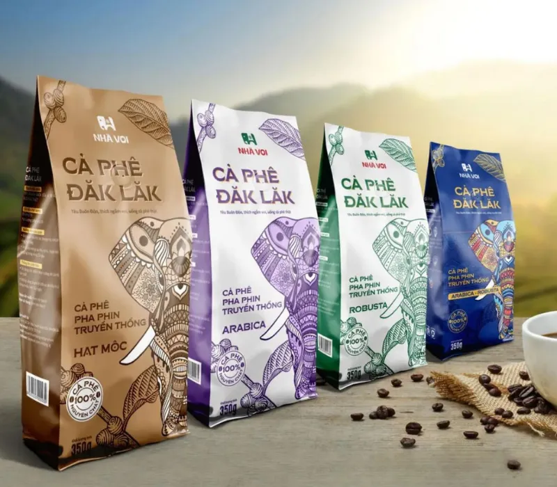
Brand Identity and Logo Consistency
In coffee packaging design, the brand logo is a symbol of trust and recognition. Whether the coffee is sourced from a single estate or blended for mass consumption, a consistent logo design assures buyers that the brand stands for something reliable.
Repeated exposure to the same logo placement and visual language builds familiarity. This familiarity plays a major role in repeat purchases, especially in a category where consumers enjoy experimenting but still return to brands they trust.
Source: in.pinterest.com
Source: in.pinterest.com
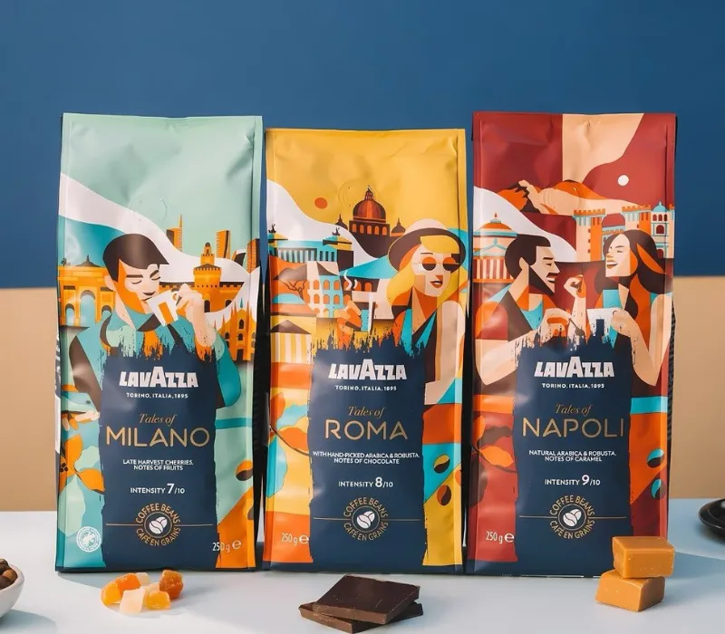
Typography and Visual Hierarchy
Typography in coffee packaging design must balance personality with readability. Artisanal brands often use expressive typefaces to convey craftsmanship, while premium or specialty brands lean toward clean, refined fonts that suggest precision.
A clear visual hierarchy ensures that the consumer understands the brand name, coffee type, and origin without confusion. This clarity is especially important in box Label Design, where information such as roast level and tasting notes must be presented in a structured way.
Source: in.pinterest.com
Source: in.pinterest.com
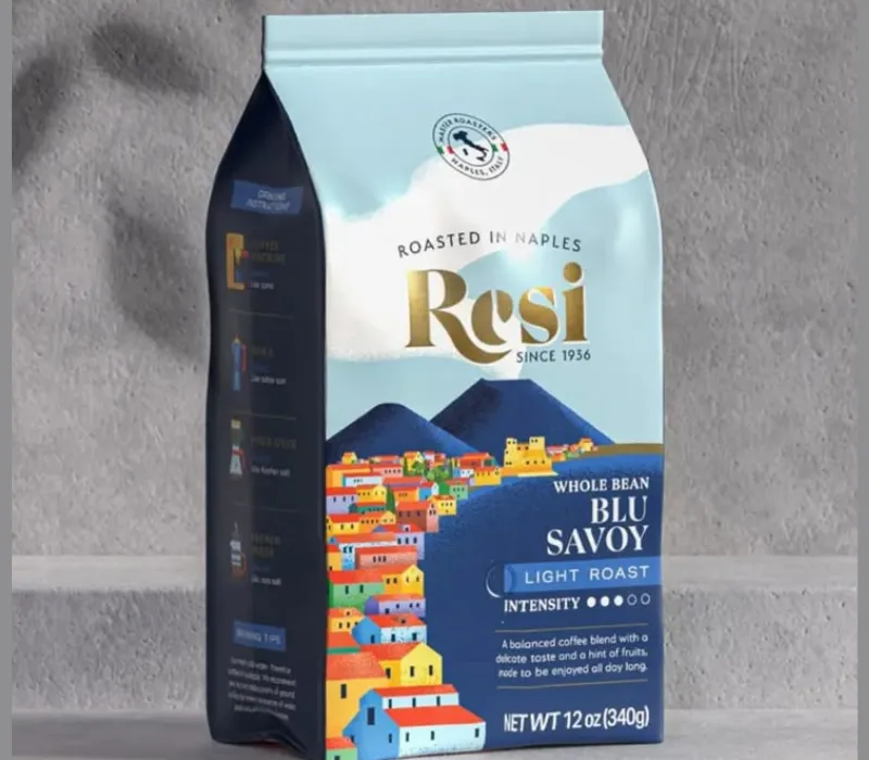
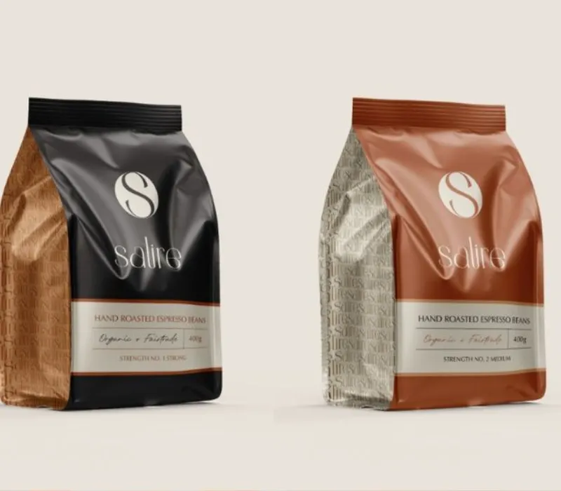
Material, Texture, and Finish
The feel of coffee packaging affects perceived quality. Matte finishes, textured papers, and soft-touch coatings often feel premium and intentional. Glossy finishes, when used carefully, can create bold shelf impact.
Material choices also reflect brand values. Sustainable packaging materials communicate responsibility and transparency, both of which are increasingly important to modern coffee consumers. These choices strengthen the overall packaging design and reinforce trust.
Source: in.pinterest.com
Source: in.pinterest.com
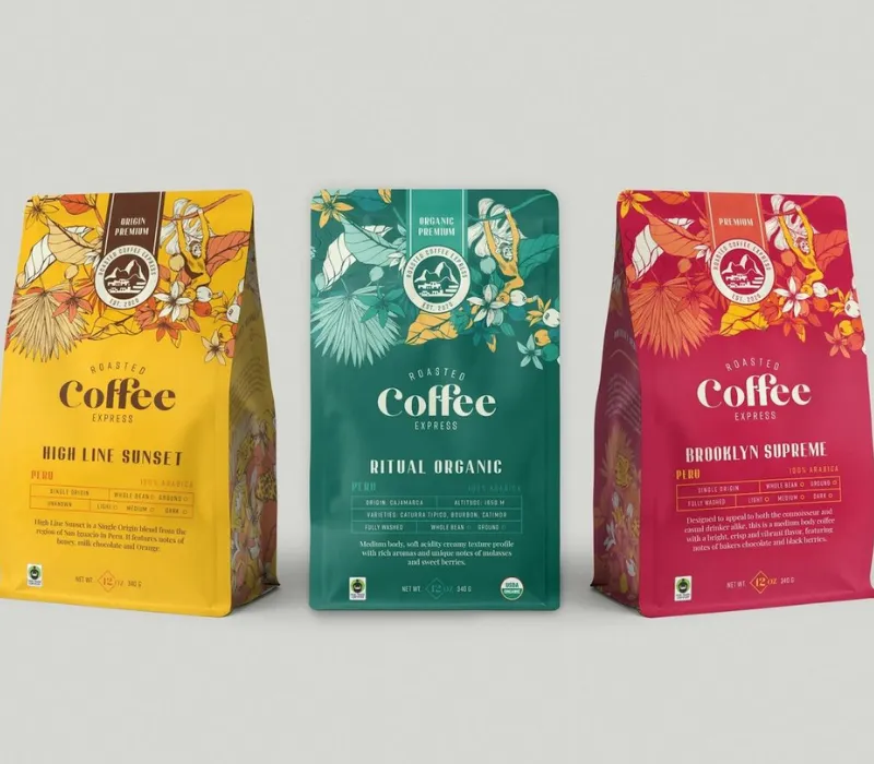
Coffee Packaging Formats and Their Design Impact
Coffee is commonly packaged in pouches, tins, or boxes, each offering a different design opportunity. Pouches provide flexibility and a modern look, while tins suggest premium quality and reusability. Boxes often add an extra layer of storytelling and protection.
A well-designed outer box supports shelf presence and gives brands space to share origin stories, roasting philosophy, and brewing suggestions. Strong box Label Design ensures this information feels intentional rather than overwhelming.
When packaging structure and design align, the product feels complete and thoughtfully crafted.
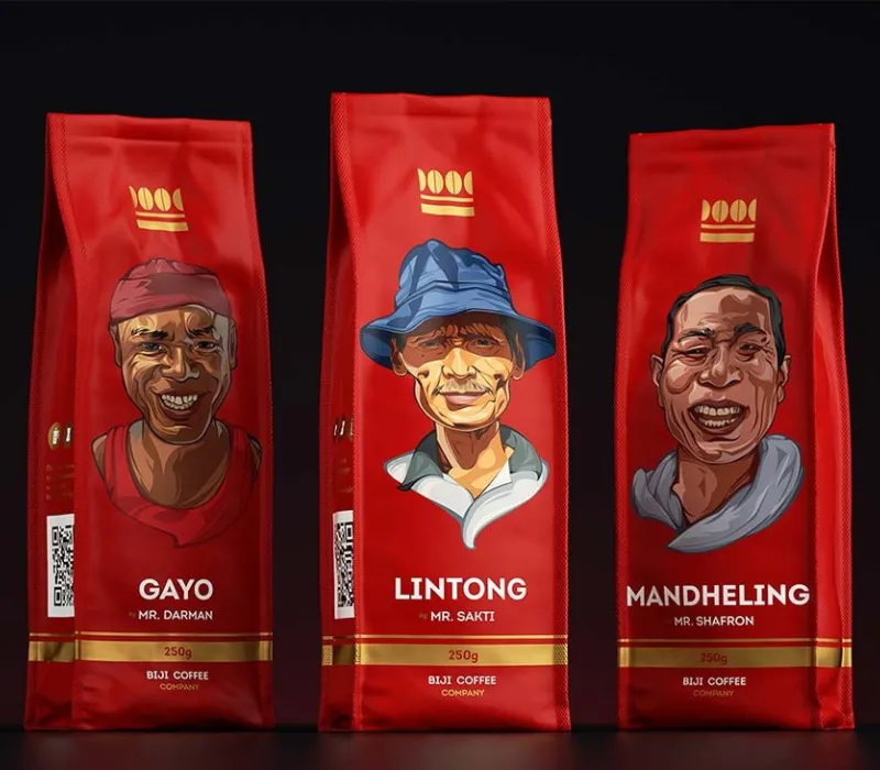
How Coffee Packaging Design Communicates Quality and Origin
Coffee lovers care deeply about origin, roast profile, and sourcing. Coffee packaging design must communicate these details clearly and honestly. Subtle graphics, maps, or typography choices can hint at geography and heritage without appearing forced.
Transparent communication builds authority. When consumers feel informed rather than sold to, trust increases. Over time, this trust becomes part of the brand’s identity, supported by consistent packaging design.
Trends Influencing Modern Coffee Packaging Design
Coffee packaging design is evolving toward simplicity and authenticity. Many brands are moving away from overly decorative designs and embracing clean layouts that feel honest and modern.
Sustainability is a major influence. Recyclable materials, minimal ink usage, and clear environmental messaging are now common, often communicated through thoughtful Label Design.
Premium brands are focusing on subtle elegance rather than loud visuals. Muted colors, restrained typography, and tactile finishes create a sense of quiet confidence that appeals to discerning coffee drinkers.
Source: in.pinterest.com
Source: in.pinterest.com

Source: in.pinterest.com
The Role of Packaging Design in Brand Positioning
Packaging defines where a coffee brand sits in the market. It signals whether the product is everyday, artisanal, premium, or experimental. This positioning is established visually before price or taste enters the equation.
Consistent packaging design across product ranges strengthens brand authority. When combined with a strong logo design, this consistency creates recognition that lasts beyond individual purchases.
Over time, packaging becomes one of the most valuable brand assets a coffee company owns.
Common Mistakes in Coffee Packaging Design
One of the most common mistakes is trying to say too much. Overcrowded designs dilute the message and confuse consumers. Another frequent issue is inconsistency, where packaging changes too often and weakens brand recognition.
Ignoring the target audience can also be damaging. Coffee packaging design that does not align with consumer expectations often feels disconnected, even if the product itself is excellent.
Avoiding these mistakes allows packaging to support, rather than undermine, the brand.
Final Thoughts on Coffee Packaging Design
Coffee packaging design is not just about aesthetics. It is about storytelling, trust, and emotional connection. In a category driven by experience as much as taste, packaging plays a central role in shaping how a coffee is perceived and remembered.
When thoughtful packaging design is combined with clear box Label Design and a strong logo design, coffee becomes more than a beverage. It becomes a brand experience that consumers return to, cup after cup.