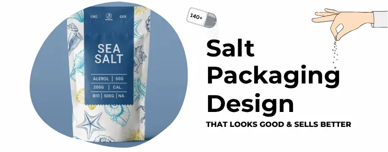
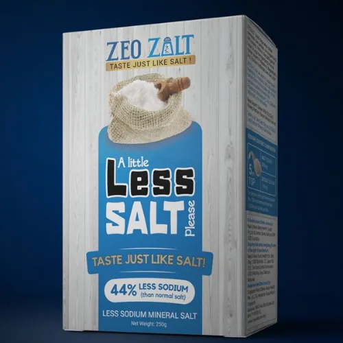
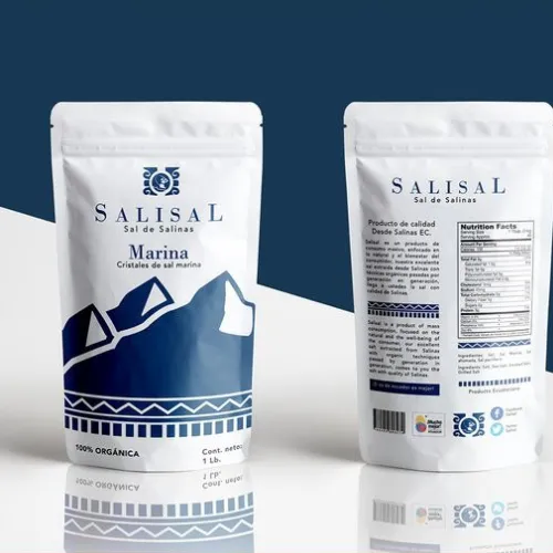
Salt is something we all use every day. But have you ever noticed how some salt packs just stand out? Whether it’s black salt, pink salt, or smoked salt, the packaging matters more than we think. Good salt packaging design doesn’t just hold the salt—it shows off what kind of salt it is, why it’s special, and makes people wanna pick it up. In today’s market, where shelves are full of different salts and spices, design is the one thing that helps your brand speak before the product even gets opened.
Why Salt Packaging Needs to Be More Than Just a Bag
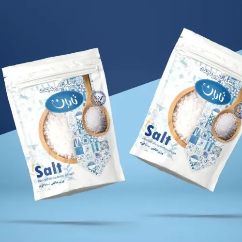
Back in the day, salt came in plain plastic pouches or boring cardboard boxes. But things are different now. People don’t just buy salt for cooking—they buy it for wellness, taste, and even gifts. So the packaging needs to match that new vibe.
Just like masala packaging design, salt packs need to be eye-catching, easy to use, and show off the product inside. Especially for special salts like Himalayan pink salt, the outside look should tell the customer this isn’t just any salt—it’s something fancy or unique.
What Makes Luxury Salt Packaging Design Work?
Luxury salt packaging design is all about keeping it simple but looking expensive. Think of soft matte finishes, earthy tones, or clear windows that show off the salt crystals. The fonts are smooth, usually lowercase or thin serif, and the info is short and clear.
Luxury packs often use glass jars, metal tins, or high-end zip pouches that don’t just hold the salt—they feel good in the hand. Some even come with wooden spoons or inside gift boxes. That kind of design makes people feel like they’re buying something premium, not just a basic kitchen item.
Source: in.pinterest.com
Source: in.pinterest.com
Source: in.pinterest.com
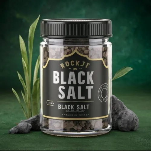
The Bold Look of Black Salt Packaging
– Dark Themes That Pop
Black Salt packaging usually plays with bold colors—dark grey, black, maybe purple—with metallic fonts or foil stamping to show its bold, deep flavor. Black salt is often used in traditional dishes or ayurvedic recipes, so the design needs to reflect both heritage and health.
Adding subtle Indian patterns or textures gives it an authentic look. You’ll see this kind of style used in masala packaging design too—something that feels rooted but still modern.
Source: in.pinterest.com

Source: in.pinterest.com
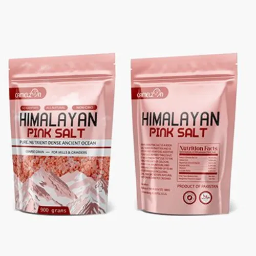
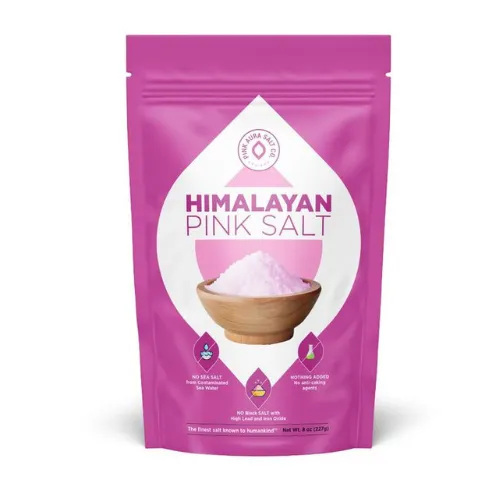
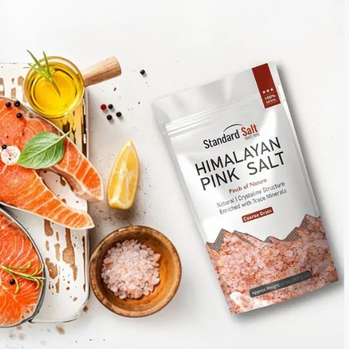
Himalayan Pink Salt Packaging Design – Soft but Strong
– Pretty in Pink
This one is all about beauty and wellness. Himalayan pink salt packaging design leans into soft pink tones, clean labels, and wellness-style branding. Many people buy this salt not just for cooking but for detox baths, skincare, and gifting too.
So the packaging must feel gentle, health-focused, and honest. Use calming colors like pastel pink, white, beige. A clear view of the actual pink salt crystals always adds a nice touch. Fonts can be hand-written style or minimalist to match the “natural” look.
Source: in.pinterest.com
Source: in.pinterest.com
Source: in.pinterest.com
Pickling Salt Packaging Design – Functional & Fresh
– For the Kitchen Pros
Pickling salt is used for specific kitchen tasks, so its design should feel practical but still look clean and trustworthy. A lot of times, pickling salt packaging design goes with basic colors like white, blue, or green.
But just because it’s “functional” doesn’t mean it has to be boring. Clear labels showing measurements, bold product names, and resealable bags make the packaging more user-friendly. Throw in a few illustrations like pickles or jars and the pack feels useful but still modern.
Source: in.pinterest.com
Source: in.pinterest.com
Smoked Salt Packaging Design – Rugged and Flavorful
– Packaging With a Smoky Story
Smoked salt gives a bold, rich flavor—and the packaging needs to say the same. Go for earthy tones like brown, copper, charcoal, maybe even some rough textures. It’s all about making it feel rustic and real.
– Smoked salt packaging design
works best with kraft paper, dark tins, or glass jars with smoky labels. A design that shows wood or fire elements makes the flavor story stronger. You’re not just selling salt, you’re selling an experience.
Source: in.pinterest.com
Source: in.pinterest.com
Source: in.pinterest.com
Design Details That Make a Difference
– Little Things, Big Impact
Here’s what really makes any salt packaging stand out:
- Windows: Let people see the salt crystals inside.
- Textures: Matte, embossed, or soft-touch labels feel good to hold.
- Fonts: Use simple but strong typefaces. Avoid over-designing.
- Color Play: Match the type of salt with the color mood. Pink for Himalayan, black for black salt, smoky for smoked salt.
Just like in masala packaging design, color and type choices need to match the flavor and feeling of the product.
Final Thoughts
Salt might be simple, but the way it’s packed can make it look like gold. From the clean vibe of Himalayan pink salt packaging design to the bold edge of black salt packaging, each design tells a story. Whether you’re going luxury, eco-friendly, or keeping it all about function—your packaging is your brand’s voice.
As a graphic agency, we know that it’s the small touches that turn regular packs into must-have products. If you’re ready to level up your salt packaging design and make it stand out in stores or online, now’s the time to do it. Let your packaging speak before your customer even reads the label.