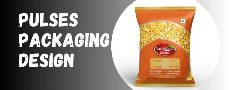
Pulses are part of every home. From dal to chickpeas, people buy them in huge amounts every single day. And with so many packets sitting on the shelf, what makes a buyer grab one over the other? Simple answer – the packaging. A nice pulses packaging design not only keeps things safe but also shows freshness and brand story. In this blog let’s talk about how packaging makes pulses stand out and why even small design choices can change the way people see your product.
Why Pulses Packaging Design Matters
We don’t always think about packaging much, but honestly it’s the first thing that talks to the buyer. If the bag looks cheap, the product inside feels cheap too. If it looks strong and clean, buyers trust it.
For pulses, packaging also has one big job – keeping dal or beans safe from moisture, dust, and even bugs. That means it needs to work hard, but also look good. When you balance both, the pack is already selling before anyone even tastes what’s inside.
Common Styles in Pulses Packaging
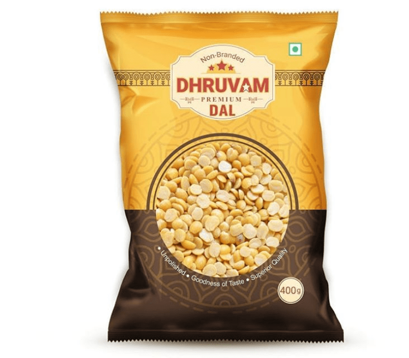
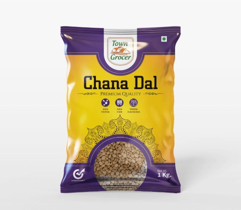
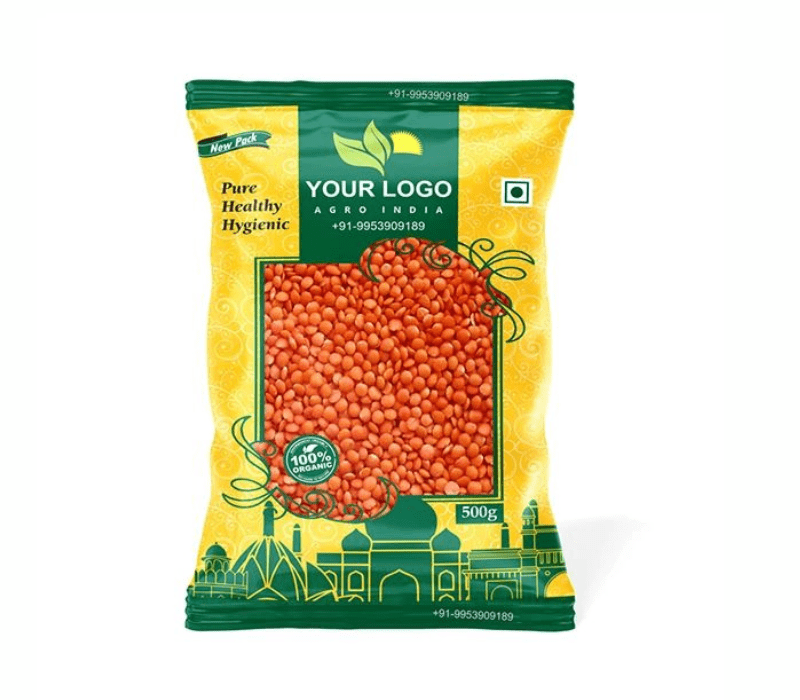
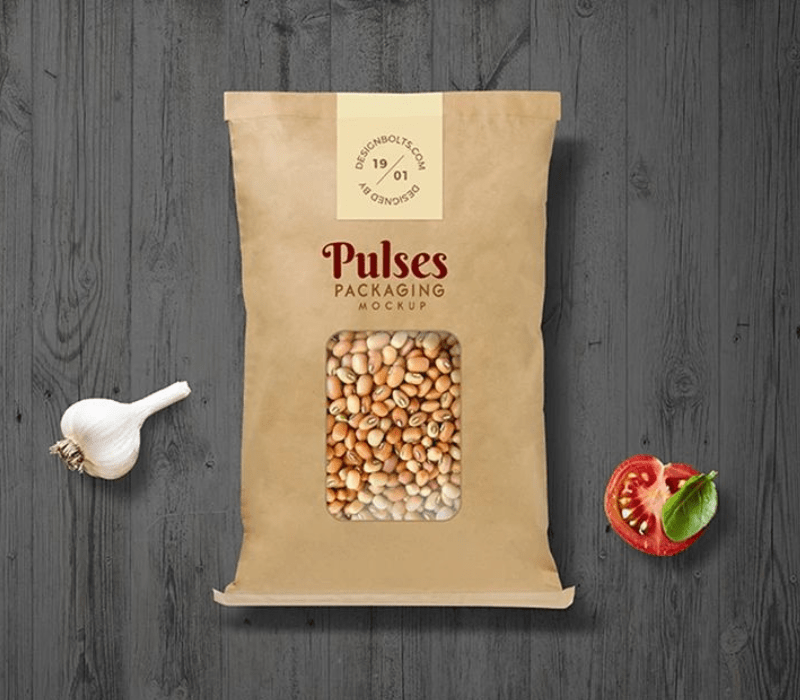
Transparent Windows
This is one of the most loved styles. A small clear window shows the actual dal inside. People like to see what they’re buying, and it builds quick trust.
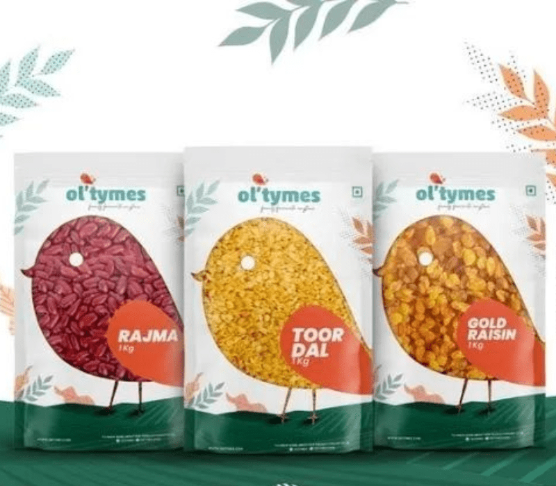
Source: in.pinterest.com
Source: in.pinterest.com
Source: in.pinterest.com
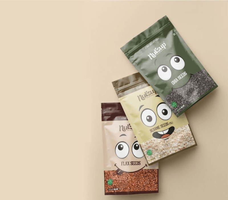
Pouches With Zippers
Modern shoppers don’t want messy packs. Zipper pouches let them open and close easily, keeping pulses fresh for weeks. It feels premium and convenient.
Source: in.pinterest.com
Source: in.pinterest.com
Source: in.pinterest.com
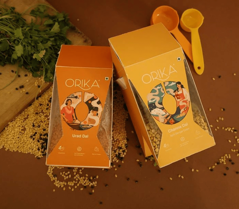
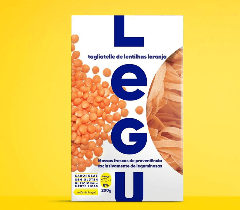
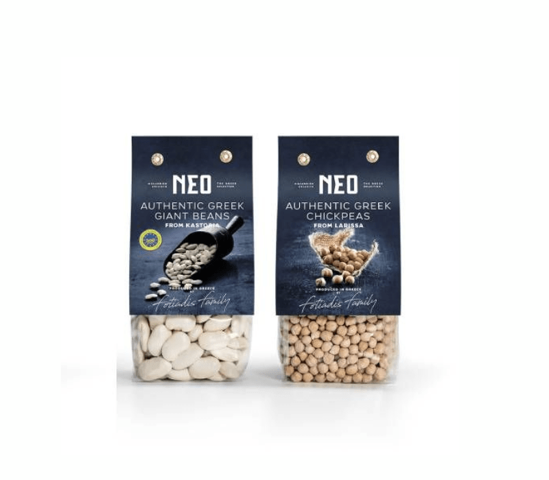
Box Packaging
Some brands try boxes with laminated bags inside. It feels luxury, almost like gifting pulses instead of just storing them. Works well for premium brands.
Source: in.pinterest.com
Source: in.pinterest.com
Source: in.pinterest.com
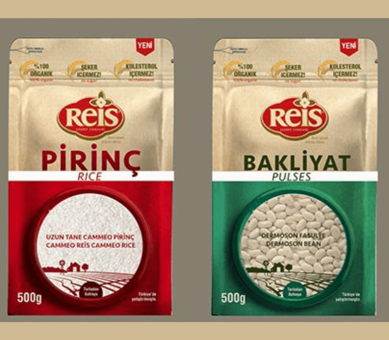
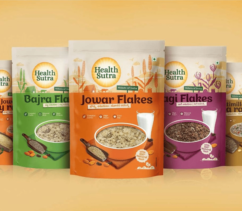
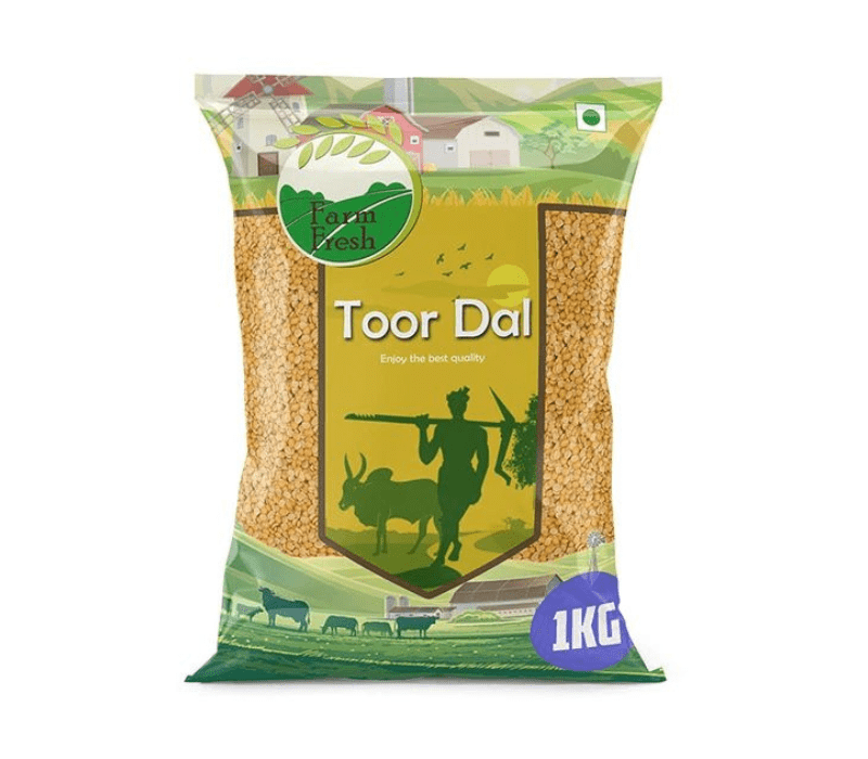
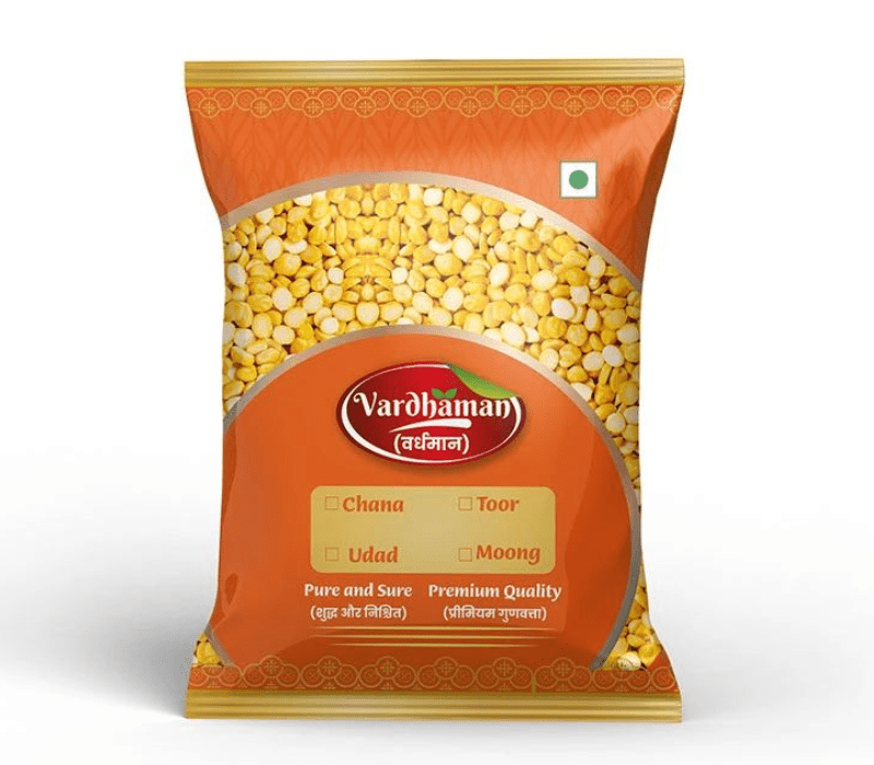
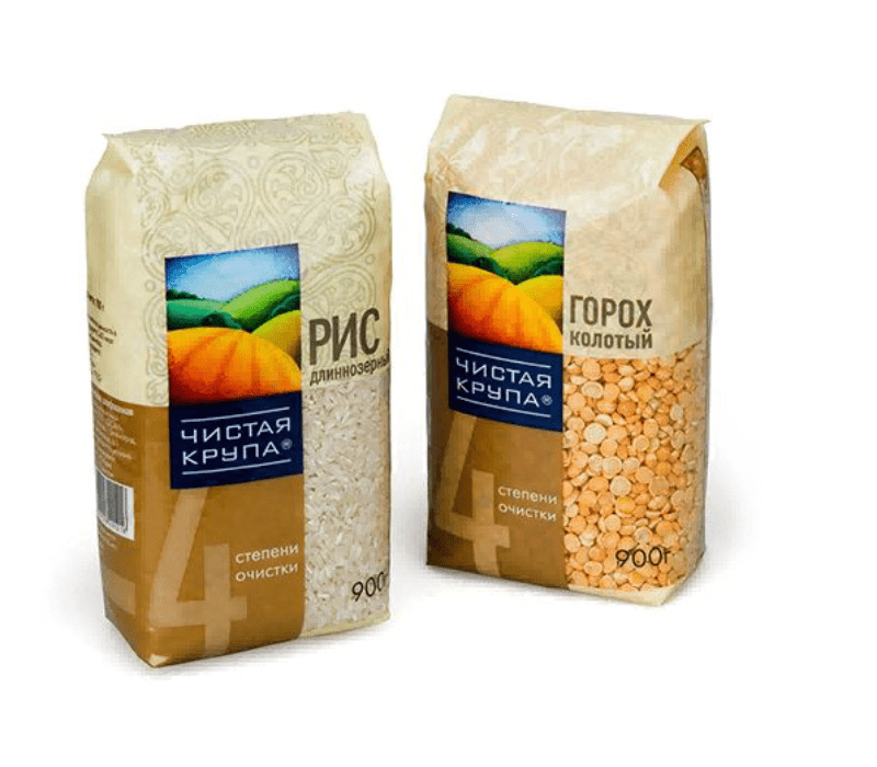
Playing With Colors and Textures
Pulses are simple food, but packaging doesn’t need to look boring. Many brands go with earthy tones—yellow for moong, red for masoor, green for peas. These colors make it easy to spot on shelves.
Textures like jute patterns or a natural brown paper vibe give an organic touch. Fonts matter too. Bold and modern letters mixed with clean white space show trust and freshness. The trick is balance. Too colorful looks cheap, too plain looks dull. The best designs sit in the middle.
Source: in.pinterest.com
Source: in.pinterest.com
Source: in.pinterest.com
Sustainable and Eco-Friendly Options
Future is green, no doubt. Shoppers now ask for packs that don’t harm the planet. Compostable film, paper-based pouches, or even reusable jars are all trending.
This connects with the idea of Vegan Food Packaging Designs, where brands highlight not just the product but also the eco values behind it. Pulses already carry a natural healthy image, so eco-friendly packaging makes the message stronger.
Source: in.pinterest.com
Source: in.pinterest.com
Source: in.pinterest.com
Branding That Builds Trust
Tell a Story
Even a small story on the back about farmers or sourcing creates connection. People love knowing where their food comes from.
Certifications
Badges like “organic” or “FSSAI approved” give instant trust. It’s simple but powerful.
Premium Touches
Matte finish, foil stamping, or an embossed logo can lift the look without making it too costly. Even daily grocery packs can feel classy.
Challenges in Pulses Packaging
- Keeping moisture away
- Managing cost vs. quality
- Standing out among too many brands
Designers often balance these with smart material use, plus graphics that don’t break the budget.
Final Thoughts
Pulses may look basic, but packaging makes a world of difference. A good pulses packaging design keeps food fresh, looks appealing, and builds trust with the customer. From zipper pouches to box Packaging design, from eco-friendly films to clear windows, brands have many choices.
At the end, packaging is more than a wrapper—it’s your handshake with the customer. If it feels real and thoughtful, people will remember your brand and keep coming back.