
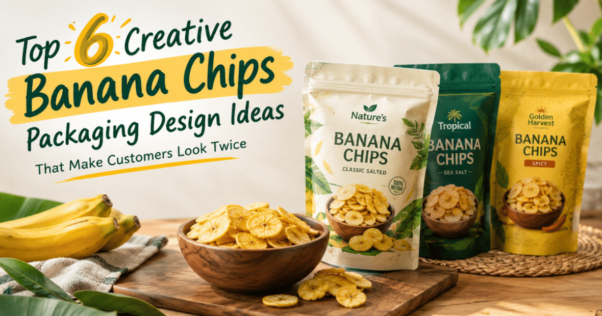
Have you ever bought a packet of snacks because it looked attractive? More than we would like to acknowledge. For most products, the packaging is the first thing a customer will see before using it. The colours, pictures, logo, and overall design help them decide if the product seems worth using.
Banana chips are the same. With so many brands out there selling similar snacks, it can be tough to make a product stand out. A packet with an interesting design may catch a person’s eye, but one with a confusing or bland design may not.
Premium Banana Chips Packaging
Fewer Colors for Better Looks
It doesn’t take loads of colours and graphics to make a packet look attractive. A simple design can sometimes have a greater impact.
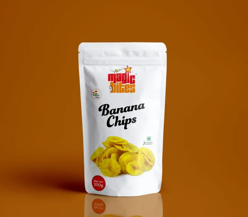
Picture a cream pouch, a clear brand name, a picture of golden banana chips and just a bit of space around each thing. The design is sleek, and the product gets the attention it deserves.
This style can work well for brands that want to sell their banana chips as a premium snack. Neutral colours, neat fonts, and balanced layouts can help create that feeling without making the packet look crowded.
Source: in.pinterest.com
Source: in.pinterest.com
Source: in.pinterest.com
Source: in.pinterest.com
Play with matte finishes and fancy fonts
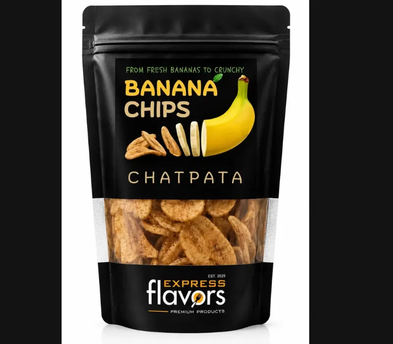
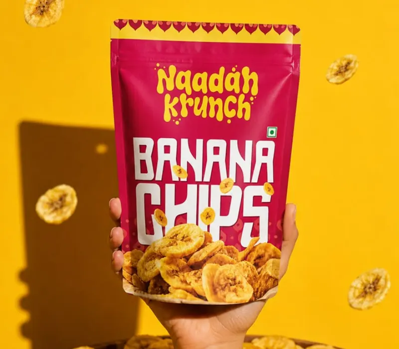
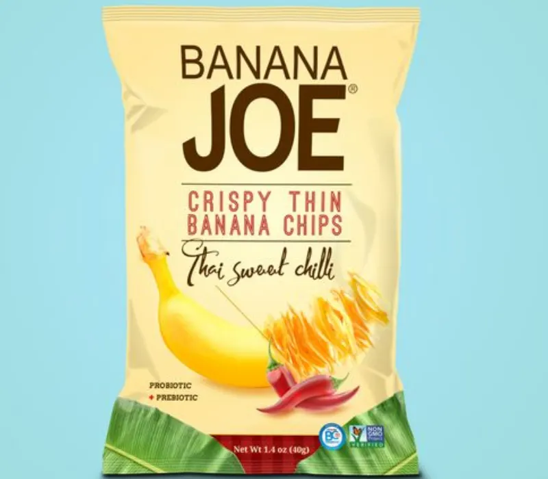
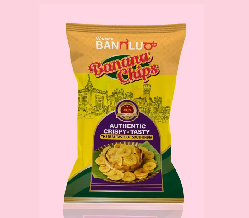
Packaging of banana chips can have a rich look with matte finish with dark green, navy blue or earthy brown. A touch of gold in a detail can make the design feel so much more special.
But fancy finishes aren’t the only aspect of premium packaging. The logo, product name, and food image should all tie in together. Too many decorative details are often less effective than a simple design that fits the product.
Source: in.pinterest.com
Source: in.pinterest.com
Source: in.pinterest.com
Source: in.pinterest.com
How Can Old Flavors Look New? Premium Banana Chips Packaging
Use Banana Leaves and Natural Dyes in the Design
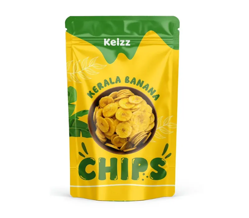
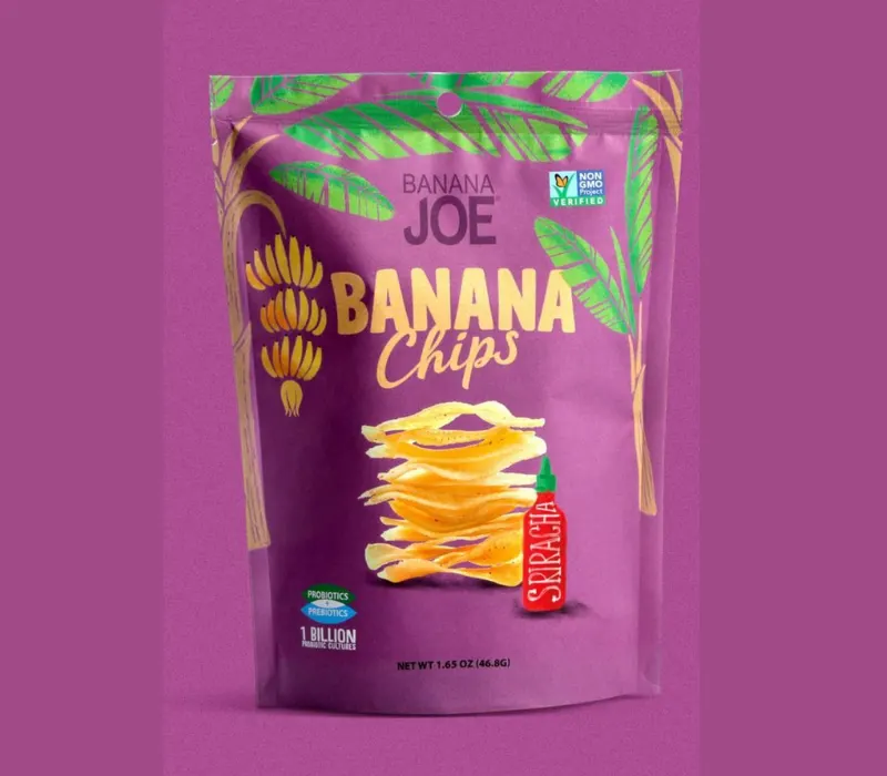
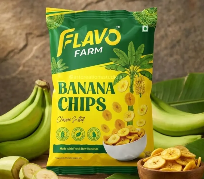
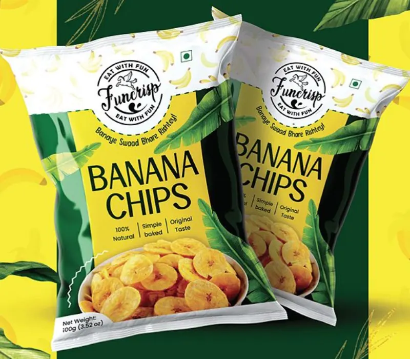
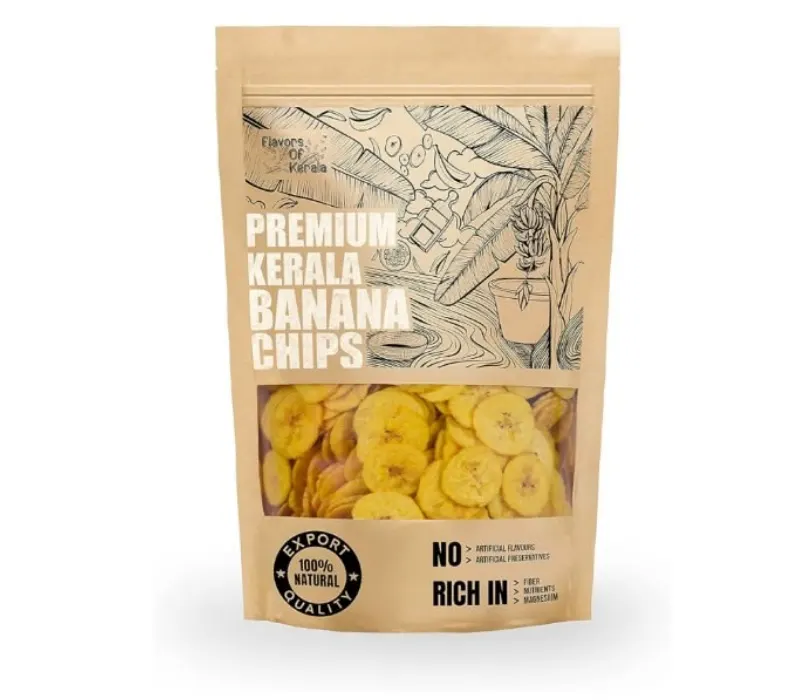
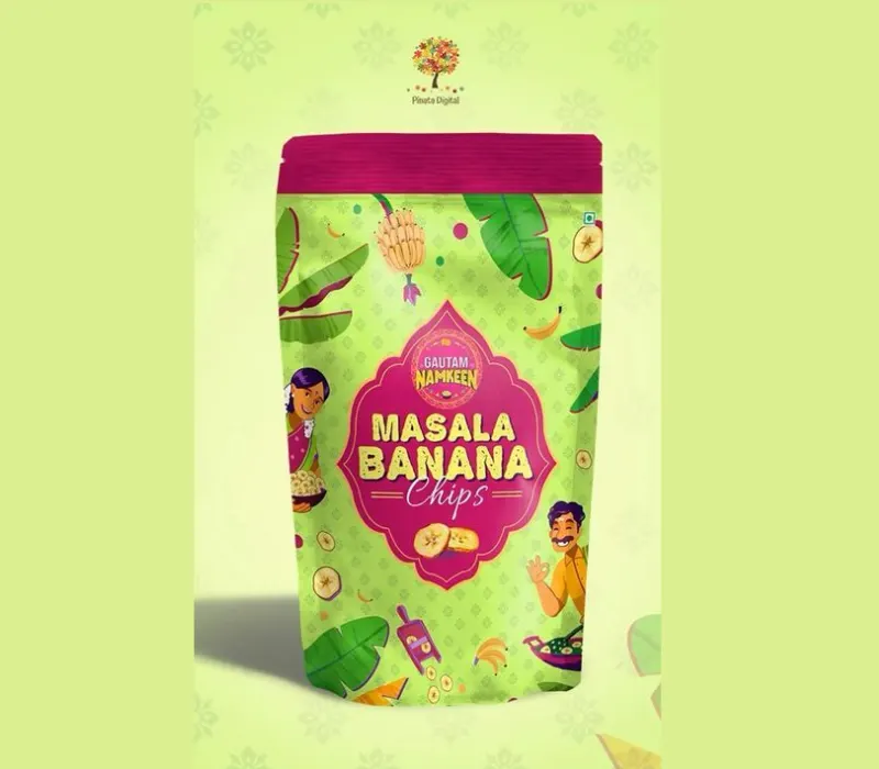
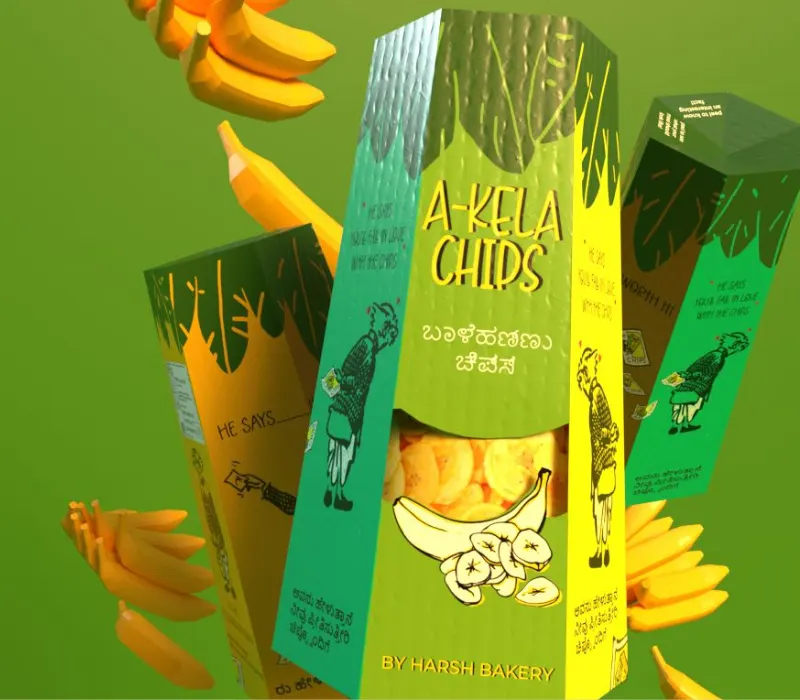
Banana chips have been a traditional snack for a long time. Packaging can be an expression of this through banana leaf designs, warm colors, simple illustrations or design that is inspired by the regional food culture.
These details make you feel comfortable without saying much. For example, a green and cream pouch with an illustration of a banana leaf can provide a product with a traditional but modern look.
Source: in.pinterest.com
Source: in.pinterest.com
Source: in.pinterest.com
Source: in.pinterest.com
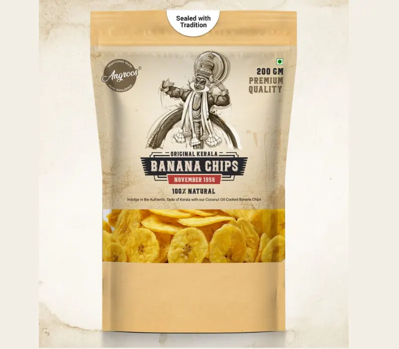
Add a Transparent Window to Show the Product
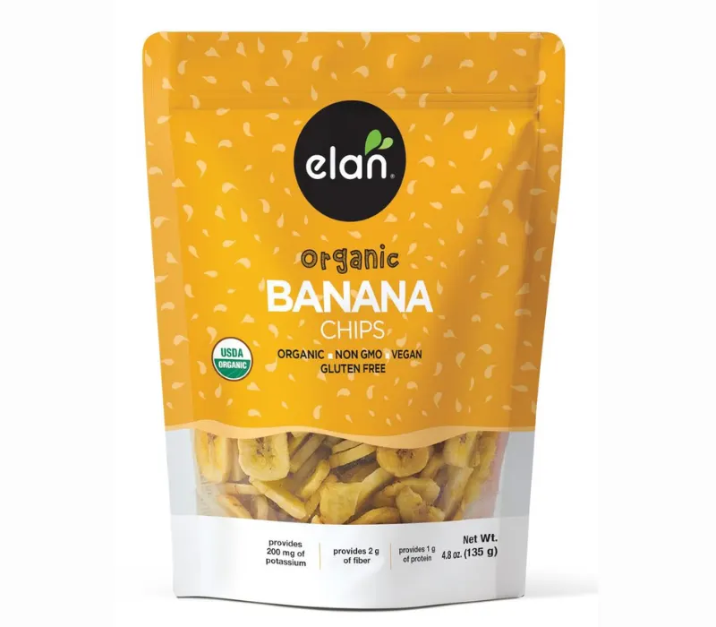
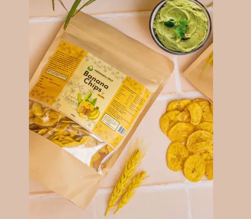
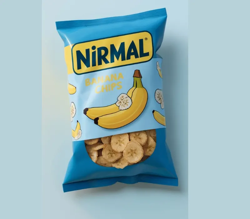
Why should customers guess what the chips look like when the packet can show them?
A transparent window lets people see the actual banana chips inside. This can make the product feel more familiar and help customers judge its appearance before buying.
Source: in.pinterest.com
Source: in.pinterest.com
Source: in.pinterest.com
Source: in.pinterest.com
Banana Chips Pouch Design: Which Colors Make Your Brand Stand Out?
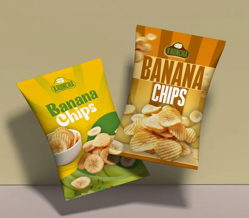
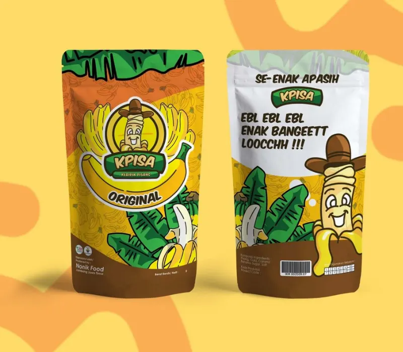
Yellow and Green Are In, But Will They Be Enough?
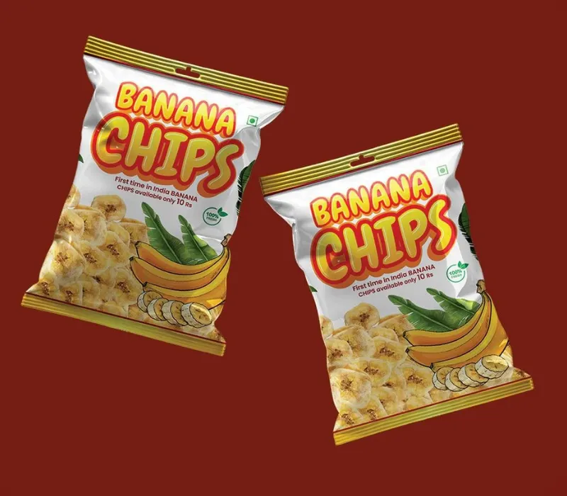
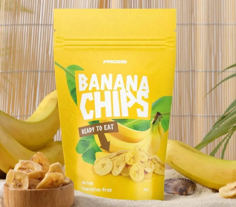
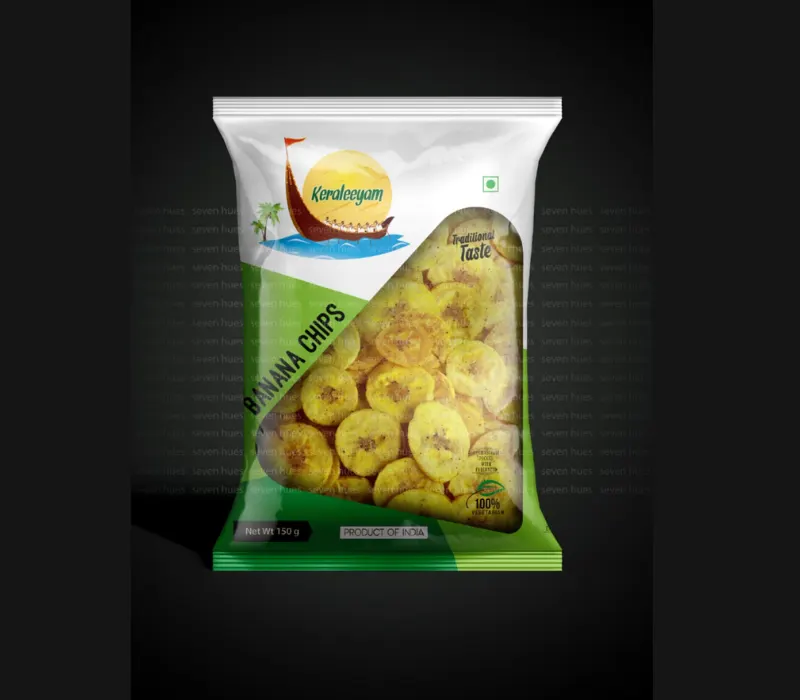
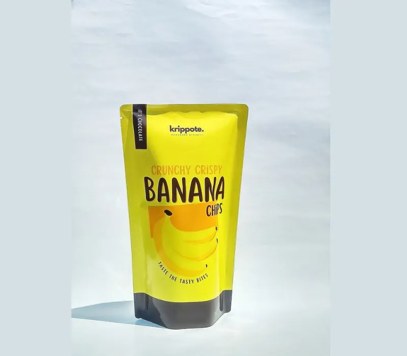
Yellow is associated with bananas, and green is often associated with natural ingredients and freshness. This makes both colors useful in the packaging of banana chips.
But there’s one issue. Many food brands use similar colors. If all the packets look very similar, customers may find it difficult to remember a particular brand.
Try a different font style, a different background color, or a special illustration. You can make small changes to make your banana chips pouch design more recognizable.
Source: in.pinterest.com
Source: in.pinterest.com
Source: in.pinterest.com
Source: in.pinterest.com
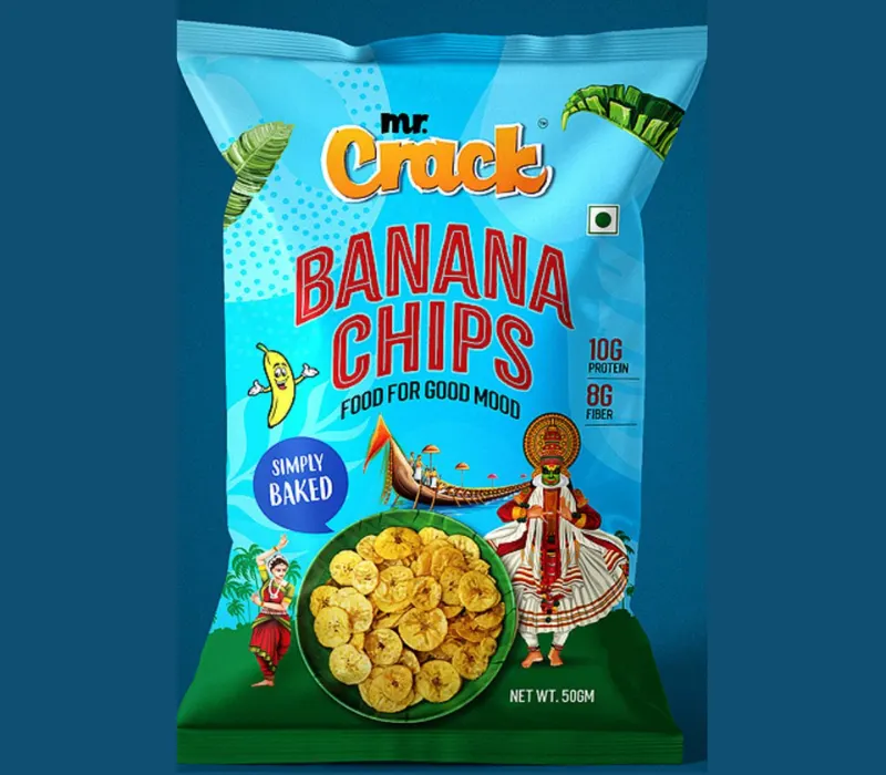
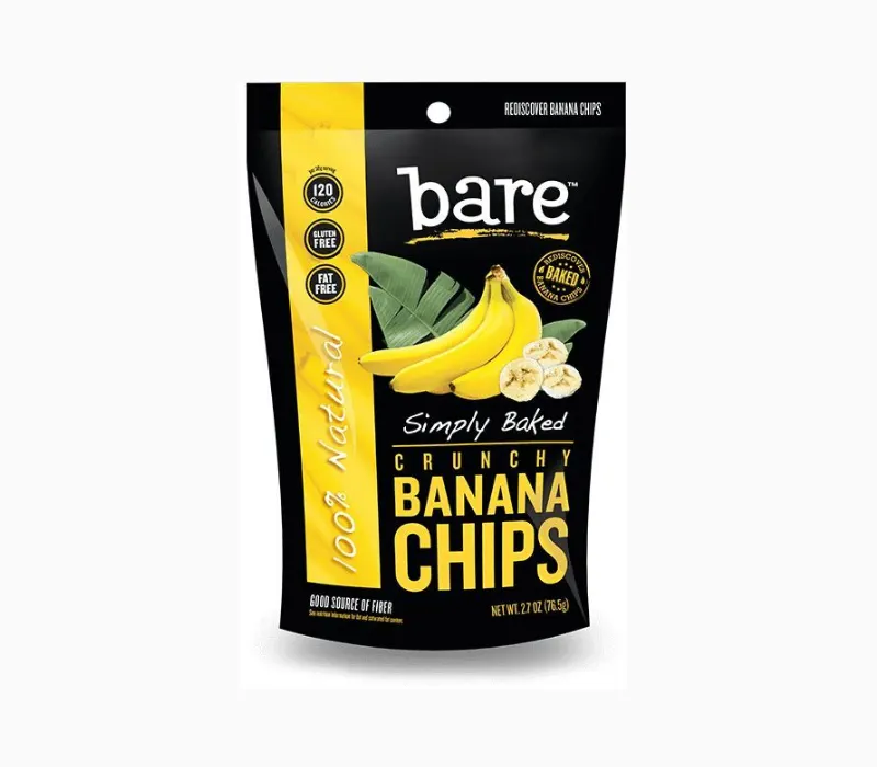
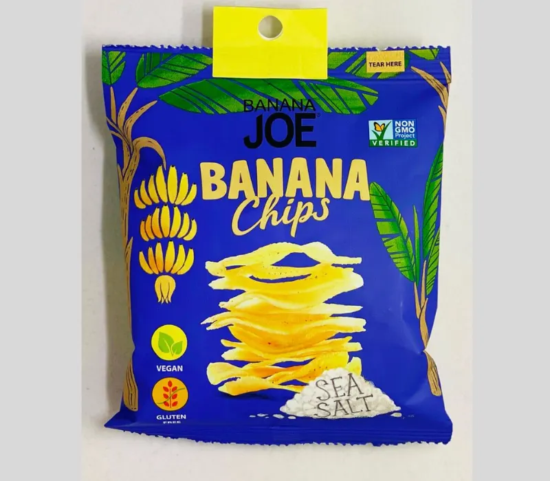
Use Bold Colors to Pop on Store Shelves
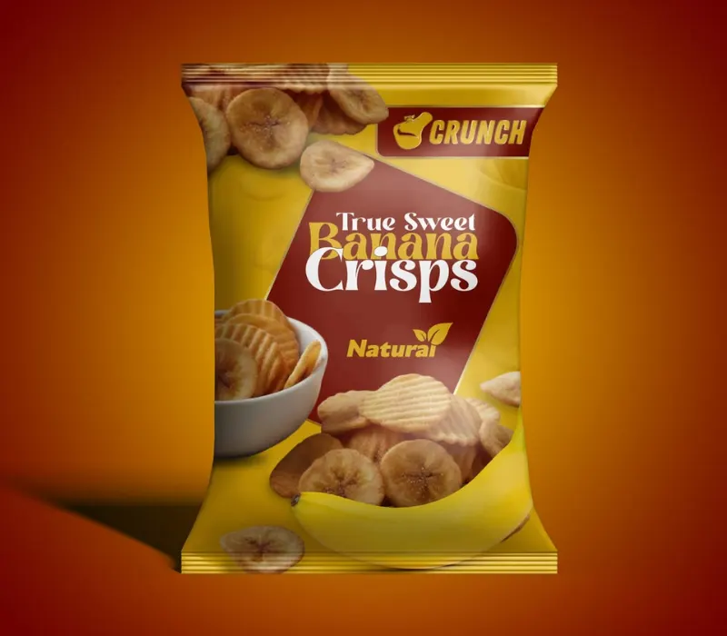
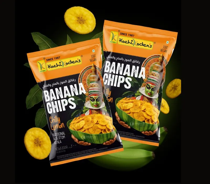
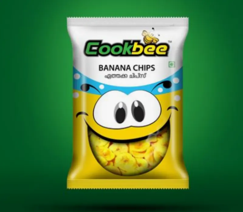
Some brands need a bright and playful look. Orange, blue, or other contrasting colours can help create an energetic design that catches attention.
This approach may work well for brands targeting younger shoppers or customers who enjoy trying new snacks.
Source: in.pinterest.com
Source: in.pinterest.com
Source: in.pinterest.com
Source: in.pinterest.com
Banana Chips Packaging Images: What Makes a Packet Attractive?
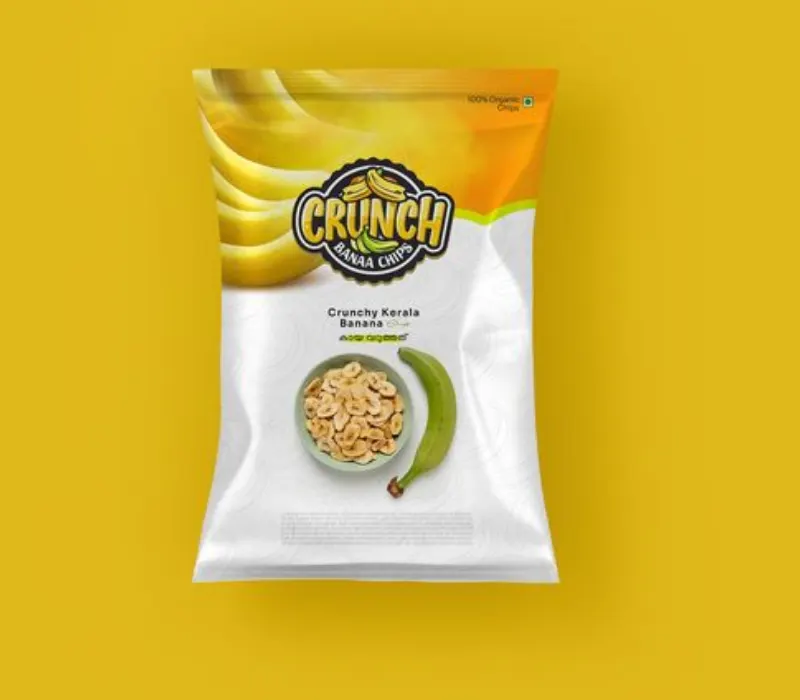
Show the crunchy texture and golden color
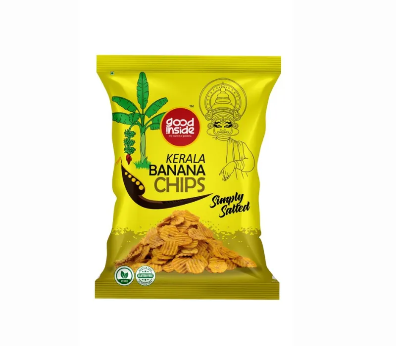
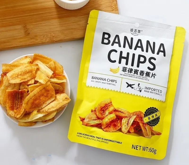
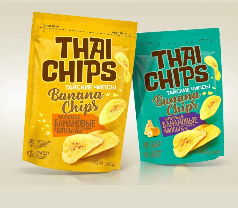
Sometimes you can’t sell banana chips with just a picture of a banana. “Customers want to see the real snack.
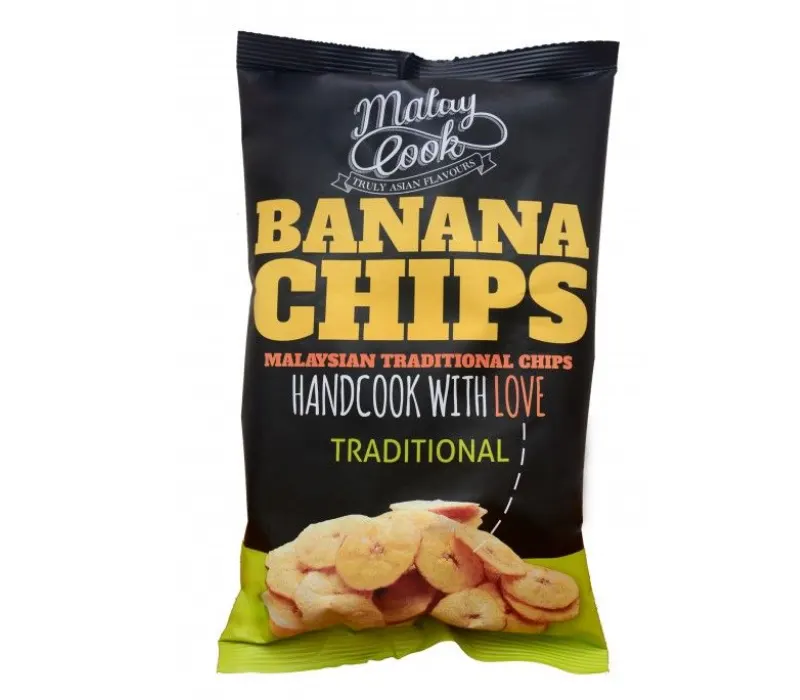
A close-up shot of golden chips can make the packaging more tempting. Color, shape and texture should look clearly natural. You could also put a small bowl of chips or a few slices next to the main image to give the design some interest.
Good food photography helps customers understand the product before they open the packet. The image must represent the product in actual form.
Source: in.pinterest.com
Source: in.pinterest.com
Source: in.pinterest.com
Source: in.pinterest.com
Opt for Illustrations Instead of Food Stock Photos
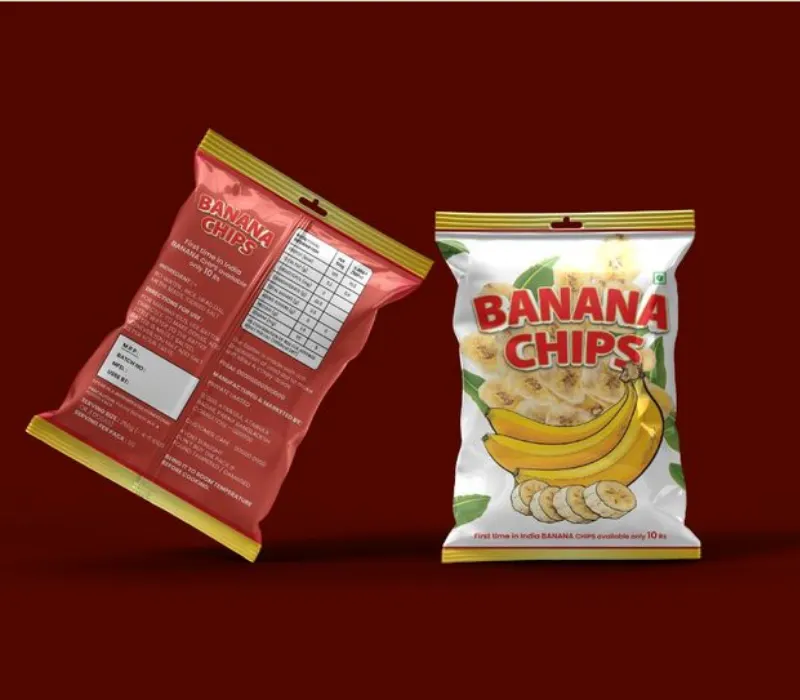
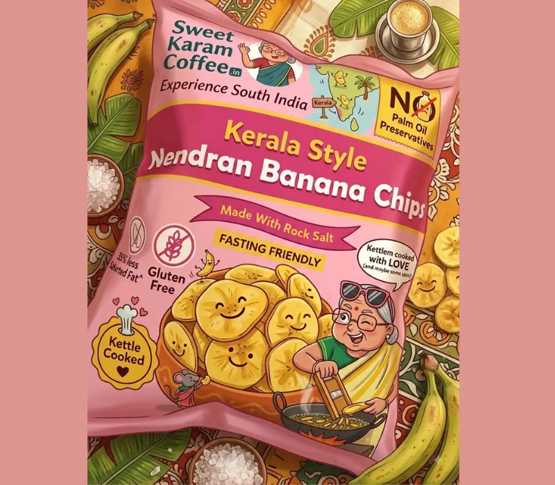
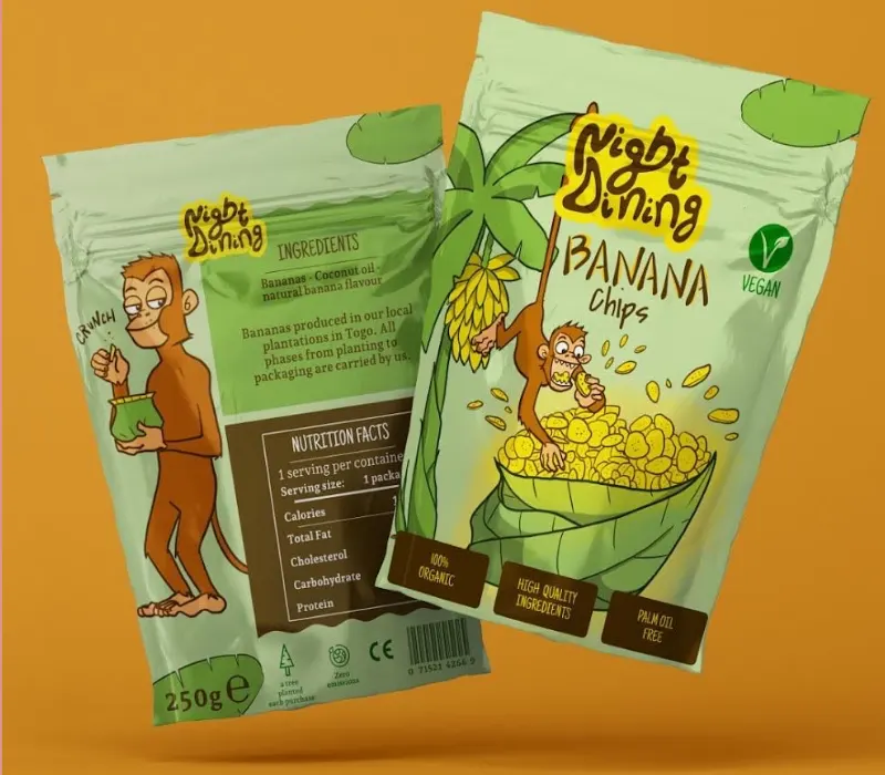
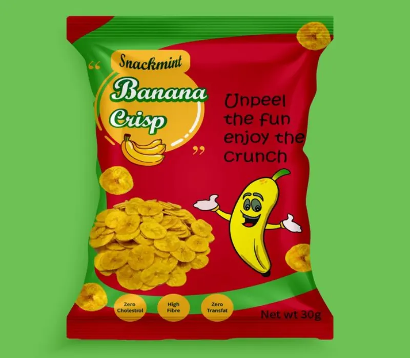
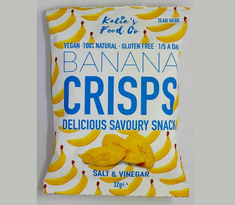
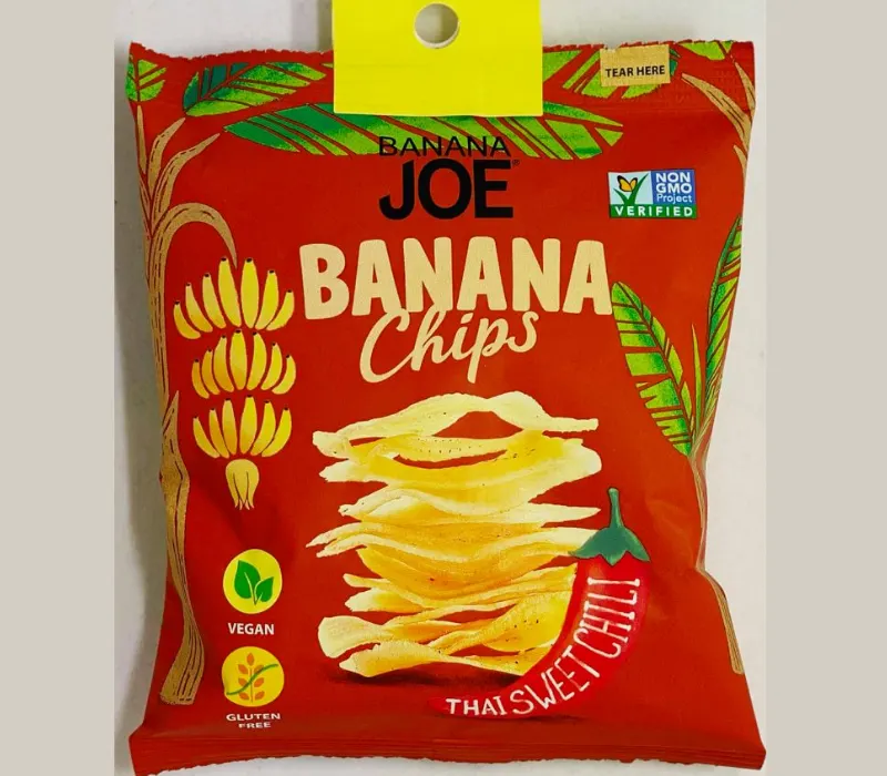
Snack brands don’t need to use the same style of food photography. Simple drawings of bananas, tropical leaves, or ingredients can give the packaging a different identity.
For example, a brand may choose to use hand-drawn illustrations on a light background, while keeping the product name bold and simple to read.
The same illustration style can be used across different flavours and pack sizes. This makes the product range look connected and helps customers recognise the brand.
Source: in.pinterest.com
Source: in.pinterest.com
Source: in.pinterest.com
Source: in.pinterest.com
Banana Chips Packaging: How To Make Your Packet Stand Out For Customers?
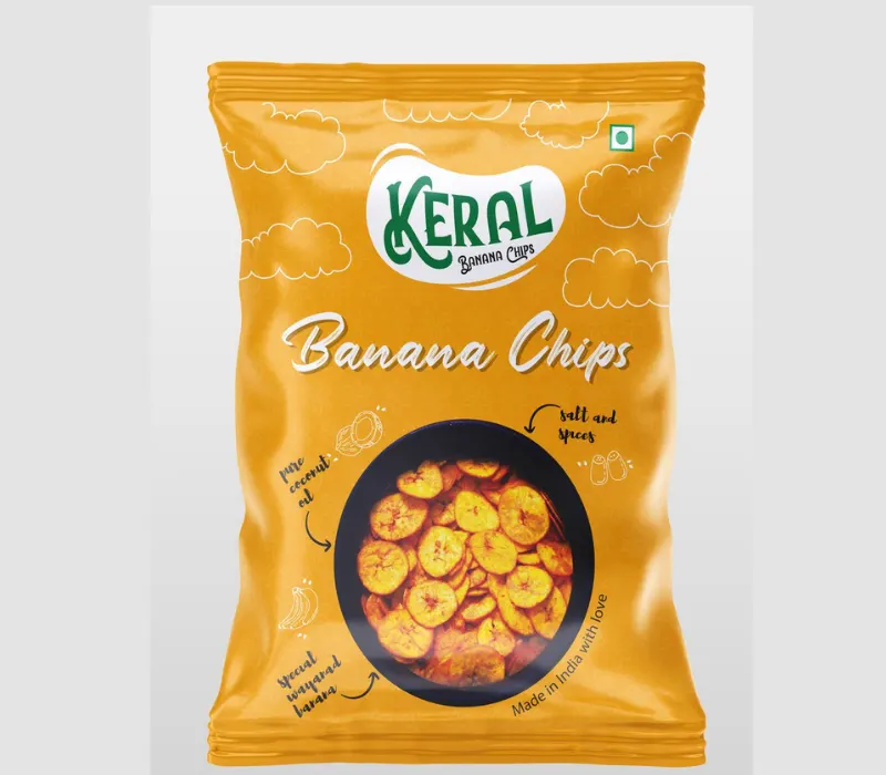
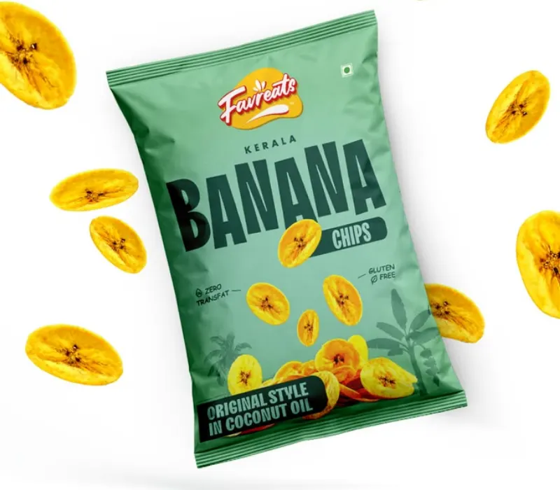
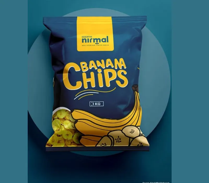
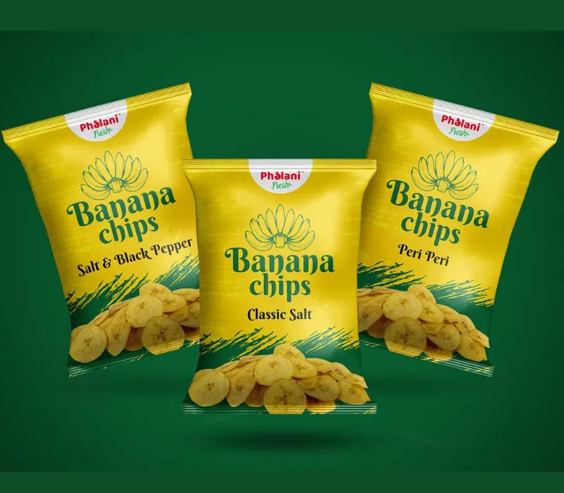
Make it easy to find your logo and product name.
Imagine a customer looking at a shelf of snack packets. They don’t have to look for your brand name or guess what’s in the packet.
Choose the logo and make sure the product name is visible. Select easy-to-read fonts and colors that pop off the background.
Having the same logo, colors, and design style on all your products means it’s easier for customers to recognize the brand when they shop again.
Source: in.pinterest.com
Source: in.pinterest.com
Source: in.pinterest.com
Source: in.pinterest.com
Design for Both Online Shops and Stores
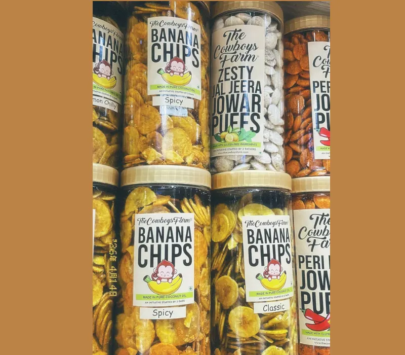
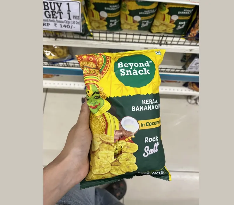
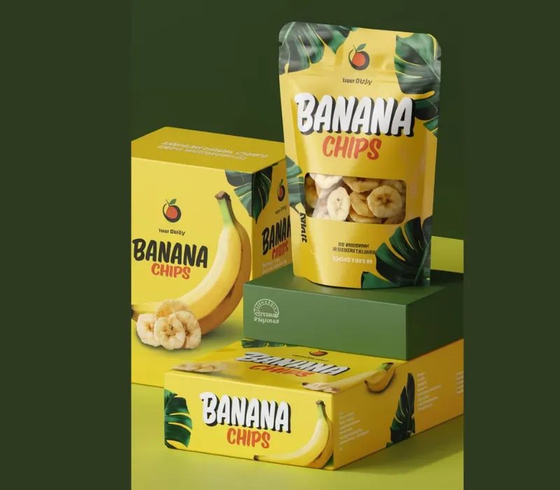
A packet can look best on a computer screen but may be hard to read when placed on a shelf or viewed as a small image on the Internet.
Test the design on a realistic packaging mock-up prior to printing. View it from a distance, and scale it down so that clients can see it on their phones.
The design is more likely to be effective in different shopping environments when the brand name and product image are still separate.
Source: in.pinterest.com
Source: in.pinterest.com
Source: in.pinterest.com
Source: in.pinterest.com
Eco-Friendly Packaging for Banana Chips – Can Sustainability Design Be Attractive?
Use Natural Colors Without False Claims:
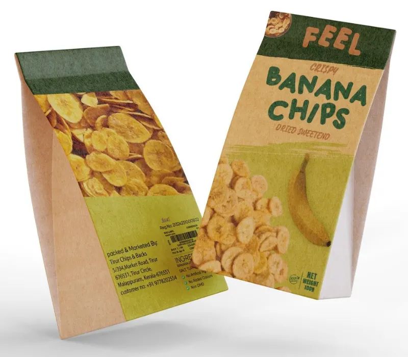
Nature-inspired designs, straightforward leaf graphics, and uncluttered layouts can make banana chips packaging look natural.
However, green colors and leaf graphics do not necessarily mean that the packet is environmentally friendly. If a brand wants to market recyclable or sustainable packaging, the messaging needs to match the actual material and what sort of recycling options are available.
Source: in.pinterest.com
Source: in.pinterest.com
Source: in.pinterest.com
Source: in.pinterest.com
Material Options: Safeguarding the Product
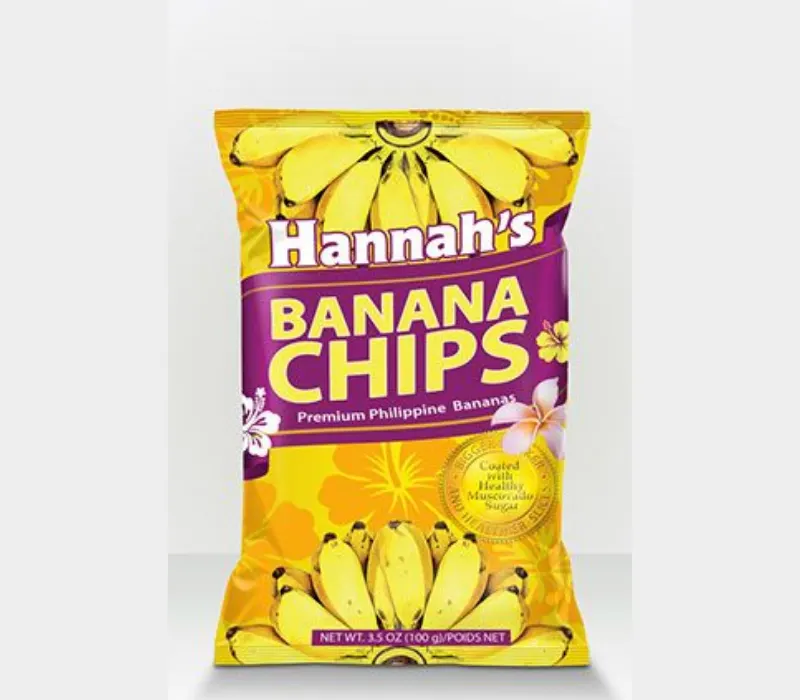
But even if packaging material can be reduced, the chips still need protection. Inadequate moisture protection of the packaging material may result in product waste.
Brands should source the right materials that balance product safety, shelf life, practical use, and environmental issues.
Source: in.pinterest.com
Source: in.pinterest.com
Source: in.pinterest.com
Source: in.pinterest.com
Conclusion
The best banana chips packaging design does not always mean the most bright, colorful, expensive, or complex. This is the one that fits the product and makes customers want to look closer.
A simple, clean pouch can be a good option for a luxury brand. A traditional brand might use familiar patterns and natural colors, while a modern snack brand might differentiate itself with bold graphics and creative illustrations.
But before you finalise the design, consider three things. What your customers like, what makes your product different, and how the package is going to protect the chips.
Was this post helpful?
Was this helpful?
11+ Creative Salad Packaging Design 2021

Water Bottle Label Packaging Design: Building Trust, Visibility, and Brand Recall
