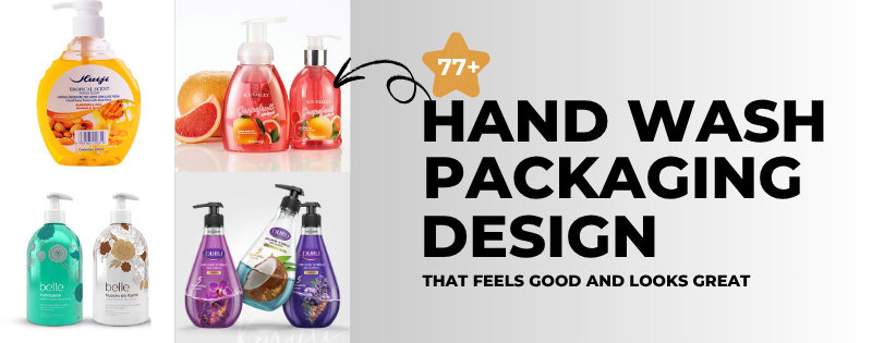
Let’s be real—who actually stops and thinks about hand wash bottles? Most of us just grab one and keep movin’. But once you start noticing, that small bottle sitting on your sink says a lot. From looking clean and fancy to being kid-friendly or better for the planet, it tells a story. Hand wash Packaging Design is about way more than just looks—it helps people feel something too.
Why Bother With Packaging Anyway?
You’re probably like, “It’s just soap, chill out.” But here’s the thing—packaging does the talking before you even use the product. A well-designed bottle says, “Hey, I’m clean, I’m safe, and yeah, I look good doing it.”
Think about it. You’re at the store staring at rows of hand washes. What makes you pick one over the others? Most of the time, it’s the design. We go for what feels right, what looks clean or matches our vibe at home.
Luxury Hand Wash Packaging Design
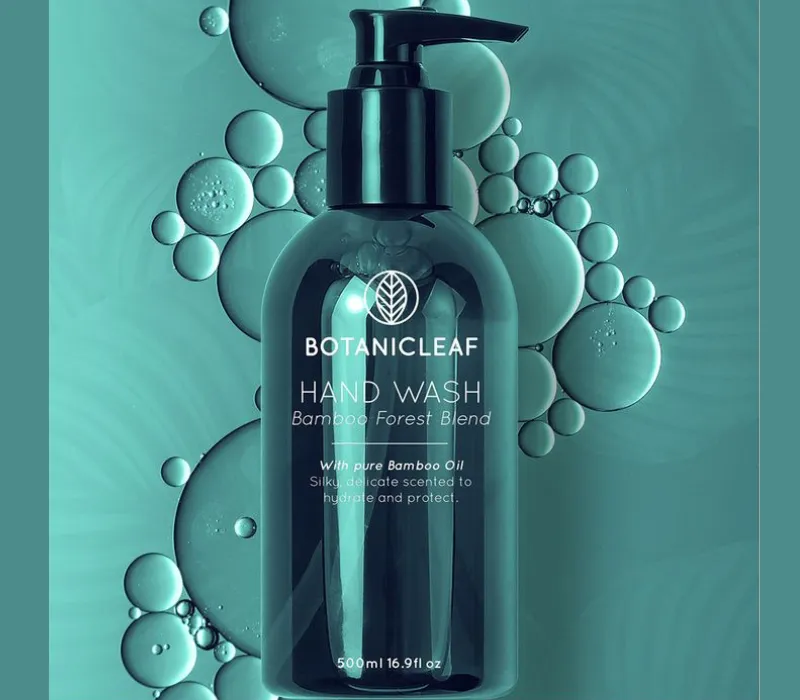
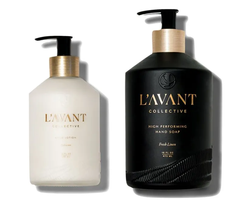
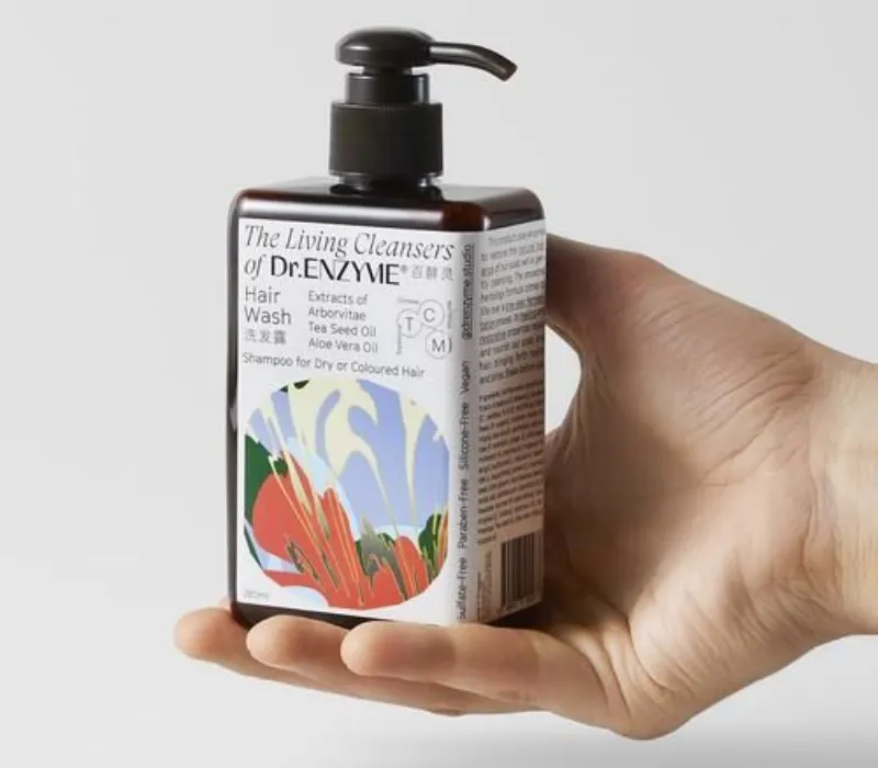
Let’s start with the fancy stuff. Luxury hand wash packaging design is all about that high-end look. Think soft creamy colors, sleek black bottles, clean fonts, and maybe even a gold or silver cap to top it off. Some brands ditch plastic and go full-on glass for that “spa at home” feel.
This is where minimal hand wash packaging design really shines. These bottles don’t shout—they whisper style. A simple logo, smooth label, and clean lines make it feel premium without trying too hard. It’s the kind of bottle that makes your sink look expensive.
Source: in.pinterest.com
Source: in.pinterest.com
Source: in.pinterest.com
Ecofriendly Hand Wash Packaging Design
Now let’s talk green—literally. Ecofriendly hand wash packaging design is huge right now. People are tired of tossing out plastic every time they finish a bottle. So, brands that use recyclable, refillable, or biodegradable stuff? Big win.
You’ll see things like kraft paper labels, bottles made from recycled stuff, and colors that feel earthy—greens, browns, or soft beige tones. It’s all about giving off that “I care about the planet” vibe while still lookin’ cute in the bathroom.
Source: in.pinterest.com
Source: in.pinterest.com

Source: in.pinterest.com
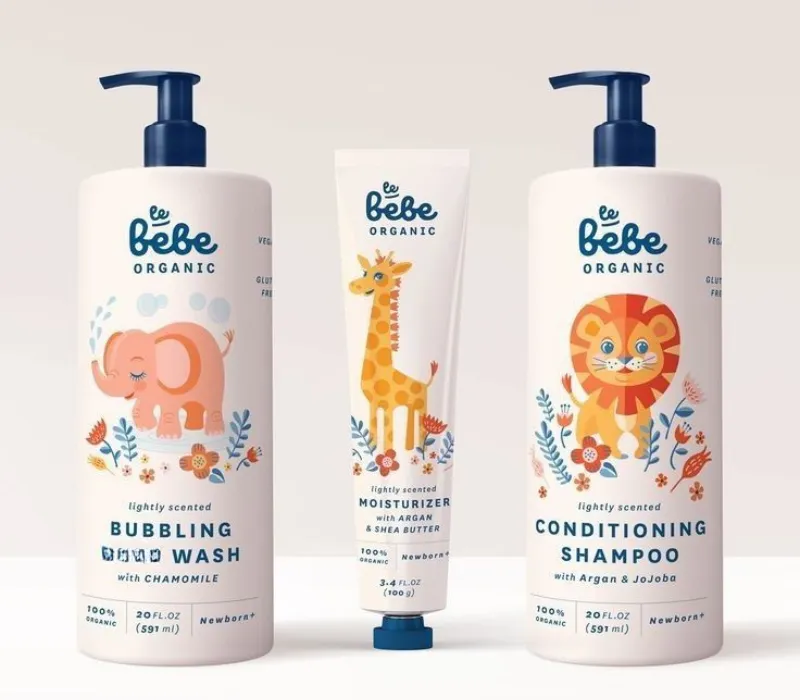
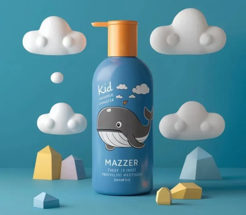
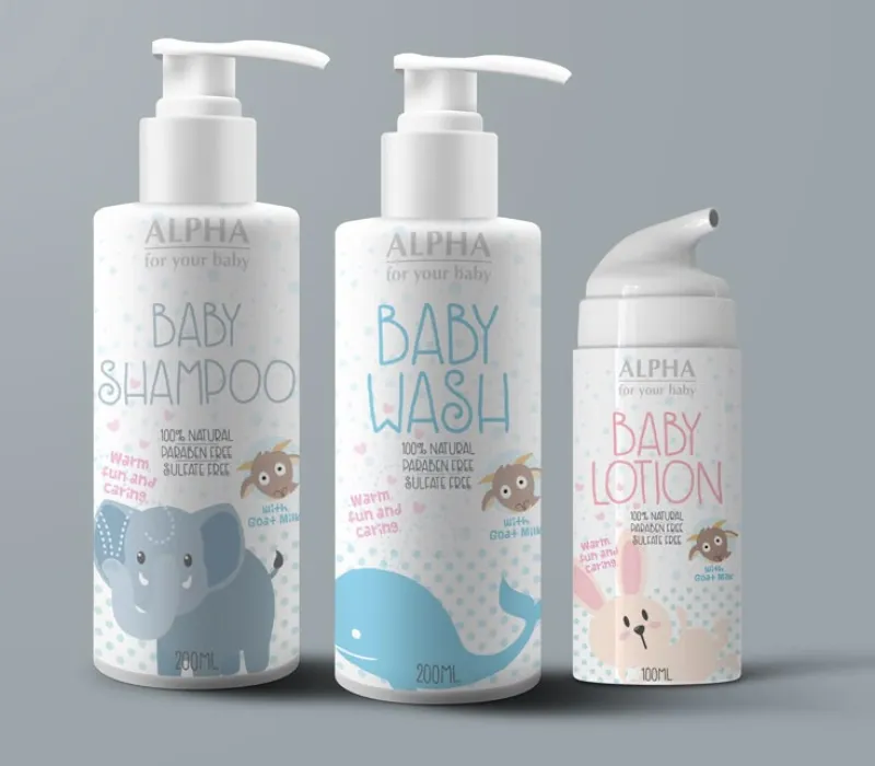
Kids Hand Wash Packaging Design
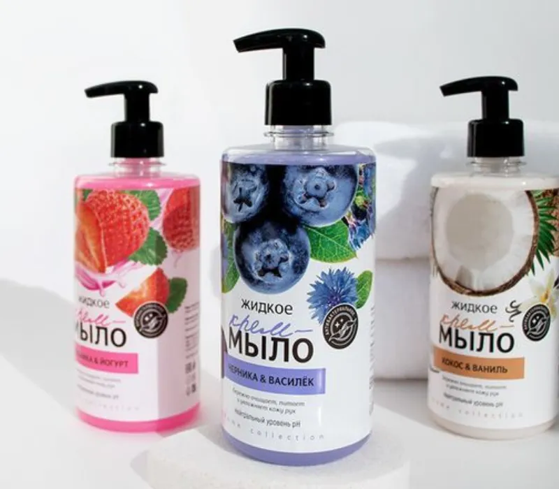
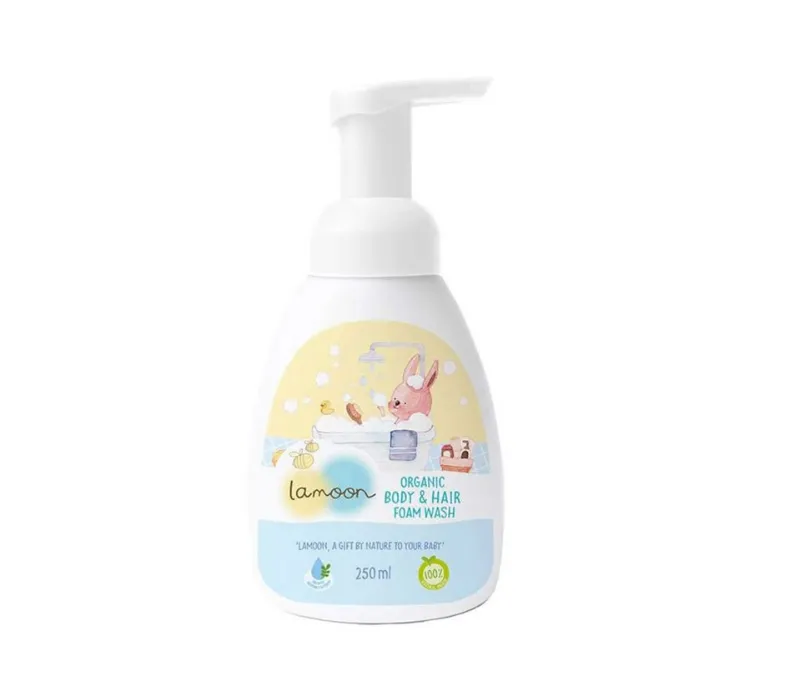
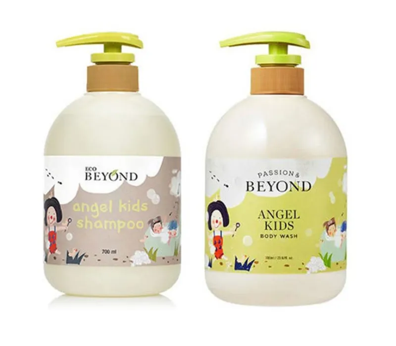
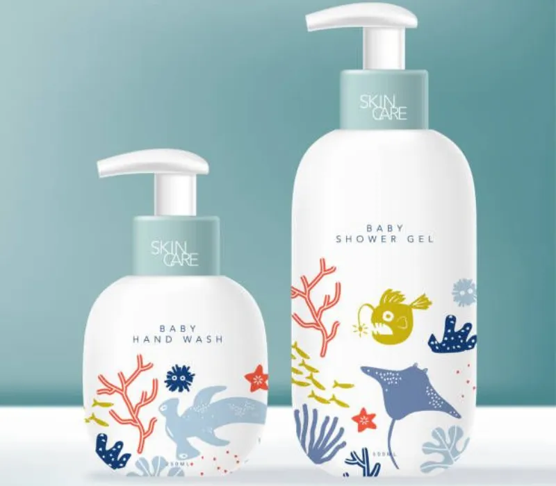
When it comes to little ones, it’s gotta be fun or they’re not gonna use it. That’s where kids hand wash packaging design comes in. Bright colors, funny characters, bottles shaped like animals or cartoon buddies—it’s all part of the game.
The goal? Make hand washing feel like a game or something they actually want to do. Some even go the extra mile with cool scents like strawberry or bubblegum. But at the end of the day, it’s the playful packaging that grabs their attention first.
Source: in.pinterest.com
Source: in.pinterest.com
Source: in.pinterest.com
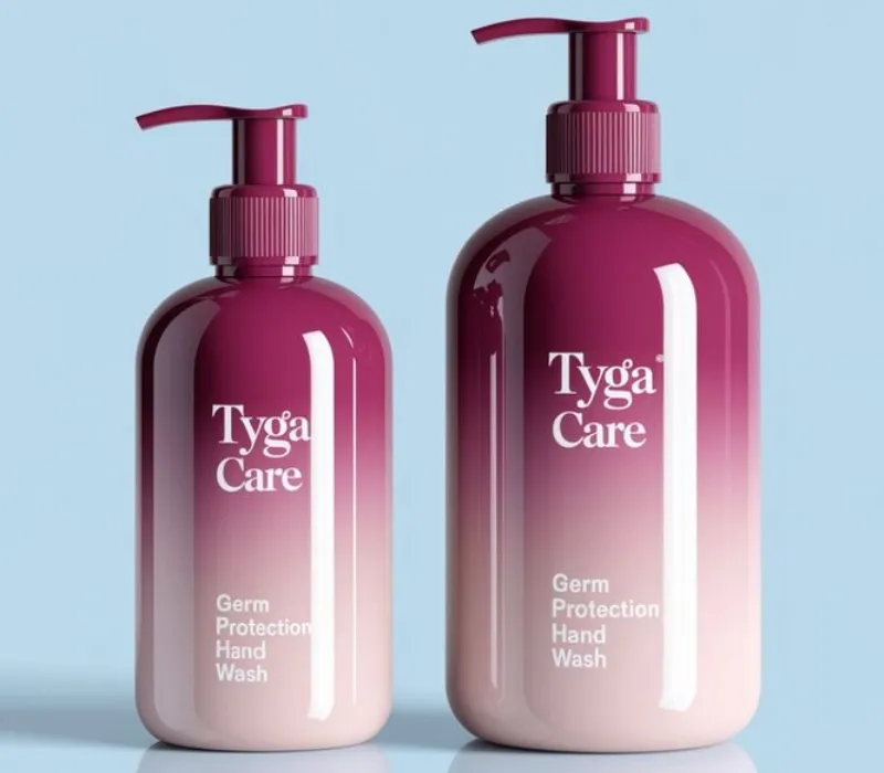
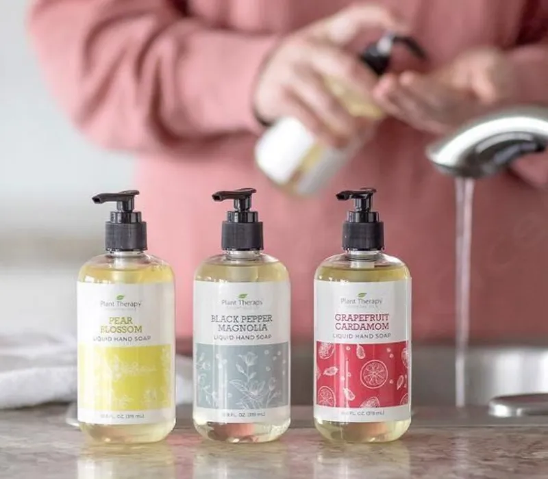
Minimal Hand Wash Packaging Design
Minimal doesn’t mean boring. It means calm. Minimal hand wash packaging design is super popular in modern homes, and it’s easy to see why. Think soft neutral colors, super simple labels, and just the name of the product—nothing more.
No loud patterns, no extra stuff—just clean design. These bottles sit on your counter and kinda disappear into your aesthetic, but still manage to look amazing. Less noise, more peace.
Source: in.pinterest.com
Source: in.pinterest.com
Source: in.pinterest.com
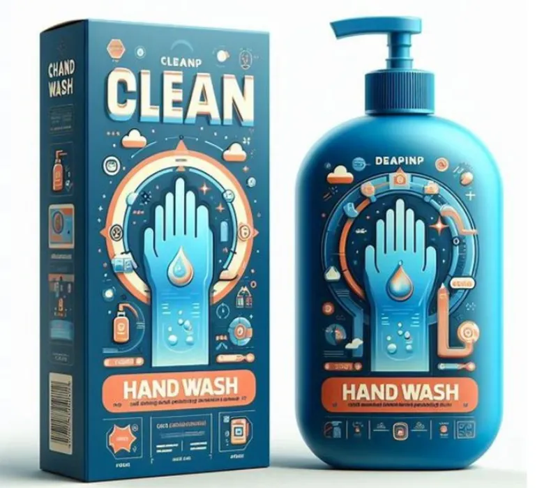
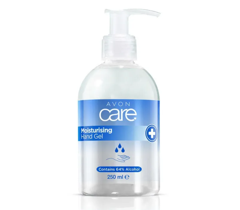
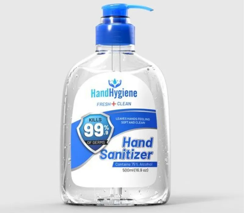
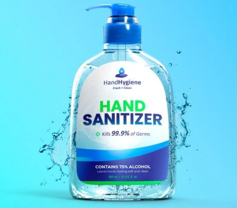
Hygiene Packaging Design
Let’s not forget, at the end of the day, it’s all about keeping clean. That’s where hygiene packaging design steps in. People want their hand wash to look fresh, sealed, and like it actually fights germs.
Clear bottles, sealed pumps, safety stickers—this stuff helps people feel like the product inside is safe and trustworthy. Even if the design is fun or fancy, it still needs to look like it takes hygiene seriously. It’s a must these days.
Source: in.pinterest.com
Source: in.pinterest.com
Source: in.pinterest.com
So, What Makes a Hand Wash Bottle Work?
When you put all these styles together, what really makes a hand wash package work?
- Looks Good – First impressions really matter.
- Feels Right – If it feels cheap or awkward in your hand, that’s a no-go.
- Says Something – Is it eco? Kid-friendly? Classy? The message should be clear.
- Fits the Vibe – If it matches your space, it’s a win.
Source: in.pinterest.com
Source: in.pinterest.com

Source: in.pinterest.com
Final Thoughts
Hand wash packaging design ain’t just about colors and logos. It’s about how people feel when they see and use the product. Whether it’s for fancy bathrooms, eco-friendly homes, fun sinks for kids, or just simple, clean vibes—design makes all the difference.
If you’re workin’ on a hand wash brand, don’t rush through the packaging. Take the time to make it feel real, look awesome, and tell the right story. Because let’s face it—clean hands deserve packaging that’s just as fresh.